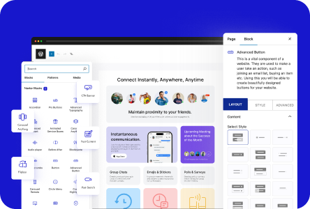
When creating a popup with the Popup Builder block from the Nexter Blocks you get the popup trigger element options within the block.
While it is a great option but at times you might want to have the trigger element outside the popup or you might want to use some custom elements like an image as the popup trigger element. You can absolutely do that with the Popup Builder block using CSS classes.
To check the complete feature overview documentation of the Nexter Blocks Popup Builder block, click here.
Requirement – This block is a part of the Nexter Blocks, make sure its installed & activated to enjoy all its powers.
Let’s say you want to use the WordPress Image block and when someone clicks on that a popup will open.
For this add both the Image block and the Popup Builder block on the page. Select the Image block and go to Advanced > Additional CSS class(es) and add a class name.

Now select the Popup Builder block and go to Display Conditions > On Any Other Element’s Click and turn on the toggle. In the Element’s Class field add the same class name.

Now the image will act as the popup toggle button you can use it to open and close the popup.
Note: Make sure there are no popup trigger elements on the page, so set the Type to Hidden in the Popup Load Settings tab.

