When it comes to creating a website, WordPress is a popular platform among developers and businesses alike. It allows users to customize their websites easily and efficiently. One of them is having collapsing sections, it helps reduce clutter and makes the page more organized and easier to navigate. It also allows users to add elements to a page without compromising the overall design.
However, creating collapsible sections in the WordPress block editor can be difficult. For this purpose, you can use the Expand block from the Nexter Blocks. It allows you to turn any content into a collapsible panel.
Required Setup
- Make sure the default WordPress Block editor is active.
- You need to have the Nexter Blocks plugin installed and activated.
- This is a Premium block, and you need the PRO version of the Nexter Blocks.
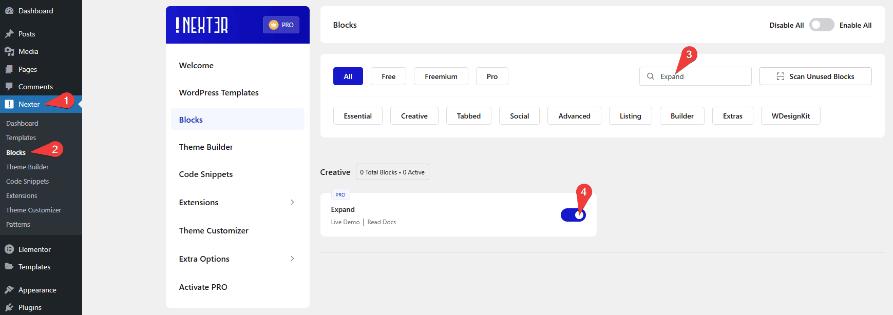
- Make sure the Expand block is activated, to verify this visit Nexter → Blocks → and Search for Expand and activate.
Learn via Video Tutorial
How to Activate the Expand Block?
Go to
- Nexter → Blocks
- Search the block name and turn on the toggle.
Key Features
- Multiple ways to add content – There are multiple ways to add content, such as Text, Editor, and Pattern.
- Extra button – You can add an extra button to the expanded section.
- Flexible button placement – You can place the collapsible buttons above or below the content.
How to add content in the Expand block?
Content
Once you add the Expand block on the page, you can add a title in the Title field.
Then you have to select the content source of the block from the Content Source section. Here you’ll find three options –
- Text – You can add the content directly using the editor in this option.
- Pattern – This option is similar to the Editor option. Here too you can use different Gutenberg blocks to create your content as a Pattern. Check the process.
- Editor – In this option, you can directly use the WordPress block builder within the Expand block. It’s a powerful option to add different types of content like images, videos, etc., and make them collapsible. Learn more.
Then, You can add different tags to your title from Title Tag and align the buttons from Toggle Alignment Options.
Expand Direction – You can place the buttons above or below the content. Here you’ll find two options –
- Expand – From the Text field, you can add the button text; from the Expand Button Icon, you can add an icon.
- Collapse – Similarly, you can add button collapse text and icon from the Text and Collapse Button Icon sections, respectively.
In the Aria Label field, you can add an Aria label to the item to improve accessibility for disabled users.
You can also add an extra button when the panel is expanded by turning on the Extra Button toggle.

On this button, you can add the button text in the Extra Button Text field.
You can add an external link to the button from the Extra Button Link field and an icon from the Extra Button Icon field.
In the Aria Label field, you can add an Aria label to the item to improve accessibility for disabled users.
Extra Options
In the Extra Options tab, you’ll find more customization options.
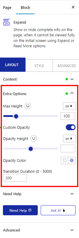
Max Height – You can set the initial height of the collapsible container for different devices.
Custom Opacity – You can adjust the content overlay’s height and color.
Transition Duration – You can adjust the panel open and collapse speed from here.
How to Style the Expand Block?
If you want to style the Expand block, you’ll find all the options under the Style tab.
Title – From here, you can style the collapsible section title. You can adjust its typography, color, alignment, and margin.

Description – You can add some margin to the collapsible panel content. But for Text, you can also adjust the typography, color, and alignment.
Toggle Button – To style the toggle buttons, you can use this panel. Here you’ll find all the styling options for the button, like padding, margin, width, typography, color, background, button icon size, placement, color, etc.
Extra Button – If you use the extra button feature, you can style it from here. You can manage the button typography, color, border, background, button icon size, placement, color, etc.
Advanced options remain common for all our blocks, you can explore all the options from here.

