









A web design portfolio is a list of screenshots, and every one of them looks like every other one.
Device mockups that scroll, and scroll together, turn the same screenshots into something worth stopping for.
For every Dynamic Device setting in one place, see the Dynamic Device block guide.
Before You Start
- Edition: Pro — the Dynamic Device block is part of Nexter Blocks Pro.
- Block to enable: Dynamic Device, switched on under Nexter > Blocks in your WordPress dashboard.
- A full-page screenshot per project, all a similar length.
Steps
- Add the Dynamic Device block and click Design from Scratch.
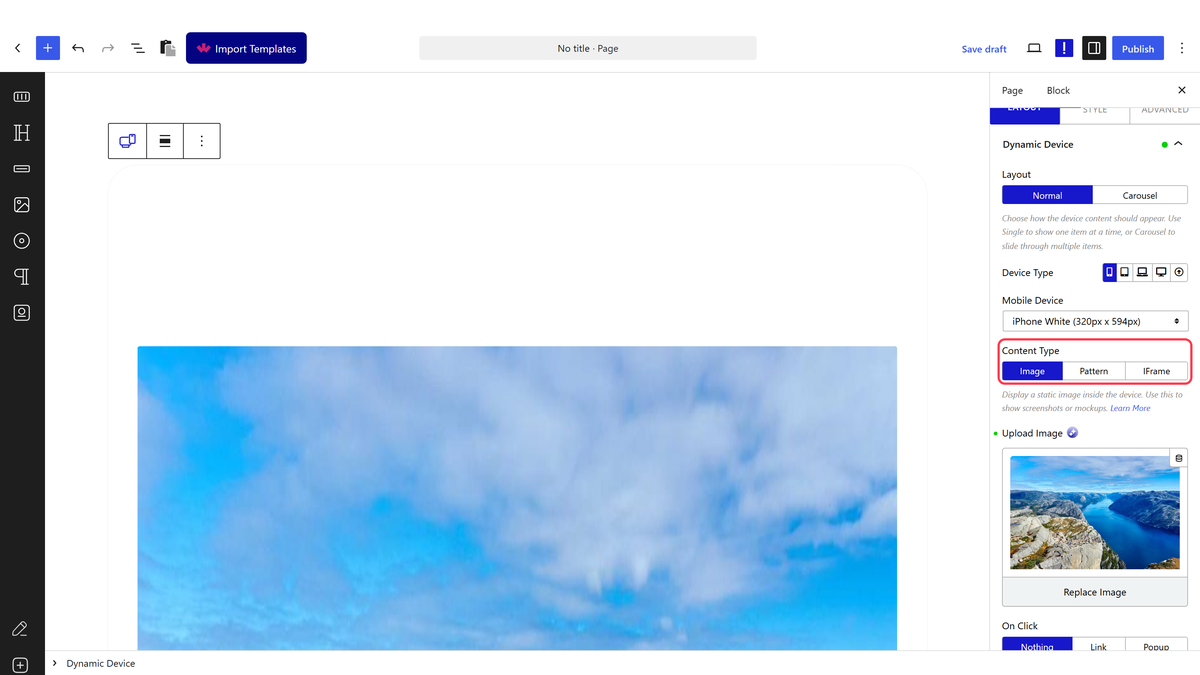
- Choose the Device Type — mobile, tablet, laptop or desktop — then pick the exact frame from the list below it.
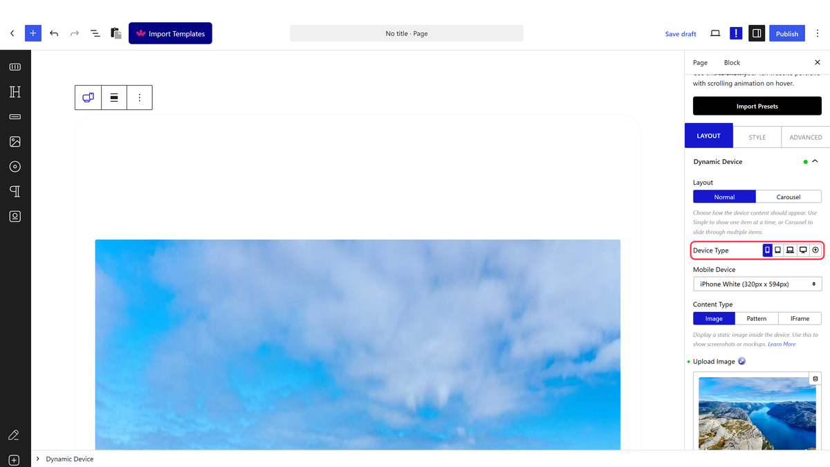
- Add a Dynamic Device block for each project and choose its frame.
- Switch scrolling on for each, and add the tall screenshot.
- Give the devices in a row the same connect name so they scroll together.
- Set a width on each block, or put each in a column.
- Publish and check the page on a phone.
Give the block a width. The device frame fills whatever space it is in, and measured at full width a phone mockup rendered 1092 by 2289 pixels — over two thousand pixels tall. Put it in a column, or set a maximum width, before you judge how it looks.
How It Behaves
- A phone and a desktop side by side is the usual pairing, and connecting them makes both scroll from one hover — the connection is a shared
data-connectddname. - Each device keeps its own screenshot, so one project per pair works well.
- Carousel is the alternative for showing several screens of a single project in one frame.
- On Click can send visitors to the live project, which is what turns a showcase into a portfolio.
Limitations
- Pro only.
- Give the block a width. The device frame fills whatever space it is in, and measured at full width a phone mockup rendered 1092 by 2289 pixels — over two thousand pixels tall. Put it in a column, or set a maximum width, before you judge how it looks.
- Several tall screenshots on one page adds up quickly. Compress them, and consider how many projects belong above the fold.
- The scrolling and the connection both rely on hover, so a phone visitor sees static mockups.
- Screenshots are pictures, so the text in them is not searchable. Give each project a real heading.
Troubleshooting
The page is extremely long
Full-width phone frames are over two thousand pixels tall. Put each device in a column, or set a maximum width.
The devices do not scroll together
Their connect names must match exactly, and each needs scrolling switched on.
It looks static on my phone
The scrolling is hover-driven. Use manual scrolling if touch visitors matter.
