Skip to content

How To Create a Sticky Column in WordPress?

Key Takeaways

  • Nexter Blocks adds a Sticky Column option to any inner container inside a multi-column Container block, and it appears automatically when the Container block has two or more columns.
  • Sticky Column uses Top Spacing and Bottom Spacing offsets plus Sticky Desktop, Sticky Tablet, and Sticky Mobile toggles, so the sticky behavior can be controlled per device without custom CSS.
  • Sticky Column activates only when the adjacent column has more content than the viewport height, so a short sibling column never visibly sticks.
  • Nexter WP troubleshooting notes that a confirmed FluentSupport ticket #14754 report shows Sticky Column can stop after editing if the toggle is no longer on the correct inner container, and width conflicts can make the sticky column expand or overlap the other column.
Table of Contents

Do you want to make a column sticky in WordPress? A sticky column is a column that stays fixed in place on the screen while the rest of the page scrolls. This keeps important content visible, such as a table of contents, a contact form, or an offer summary, without requiring the visitor to scroll back up.

With the Sticky Column option from Nexter Blocks, you can make any column in a multi-column layout stick to the screen as the user scrolls.

Best Used For:

  • Blog posts with a sticky table of contents column on the side
  • Landing pages where a pricing summary or CTA button stays visible while the visitor reads a long feature list
  • Service pages where a contact form column remains accessible as the visitor scrolls through details

Required Setup

  • Make sure the default WordPress Block editor is active.
  • You need to have the Nexter Blocks plugin installed and activated.

Why It Matters

CSS position: sticky can pin an element, but making it behave correctly inside a Gutenberg multi-column layout, respecting the header height, stopping before a footer, and behaving differently on mobile, normally means custom CSS per breakpoint. The Sticky Column option puts those controls directly in the inner container’s Layout settings, so there is no stylesheet to maintain.

What You Get

  • A Sticky Column toggle on any inner container inside a multi-column Container block
  • Top Spacing and Bottom Spacing offsets so the sticky column clears a fixed header or footer
  • Independent Sticky Desktop, Sticky Tablet, and Sticky Mobile toggles

Benefits

  • No custom CSS – sticky positioning, offsets, and per-device control are all settings fields, not a stylesheet you maintain.
  • Per-device control – a sticky sidebar that helps on desktop but eats screen space on mobile can be turned off for mobile only, without a media query.
  • Header-aware offsets – the Top Spacing field lets the sticky column clear a fixed site header instead of sitting underneath it.

Capabilities

  • Make any column sticky – enable the Sticky Column toggle on any inner container within a multi-column layout to keep it fixed on screen while the adjacent column scrolls.
  • Per-device control – individually enable or disable the sticky behavior for desktop, tablet, and mobile using the Sticky Desktop, Sticky Tablet, and Sticky Mobile toggles.
  • Top/Bottom Spacing – set the pixel distance from the top and bottom of the viewport where the column starts and stops sticking.

How It Works

There are no separate activation steps for the Sticky Column option. When you add a Container block from Nexter Blocks with two or more columns, the Sticky Column option appears automatically in the inner container settings. The sticky effect only activates once the adjacent column has more content than the viewport height – a column next to short content has nothing to scroll past, so it never visibly “sticks.”

How to Use It

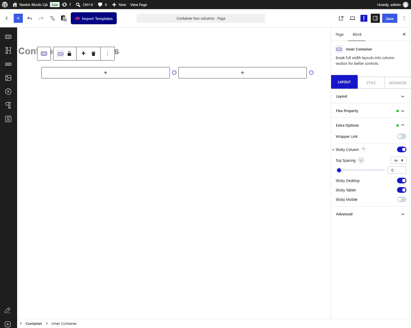
Add the Container block from Nexter Blocks with multiple columns. Select one inner container.

1. Go to the Layout tab and open Extra Options.

2. Turn on the Sticky Column toggle.

Sticky Column toggle in the inner container's Layout Extra Options
Enabling the Sticky Column toggle on an inner container

In the Top Spacing field, set the distance in pixels from the top of the viewport where the column sticks. Use this to account for a fixed header so the sticky column does not overlap it.

In the Bottom Spacing field, set the distance in pixels from the bottom of the viewport where the column stops sticking. Use this to prevent the sticky column from overlapping a sticky footer bar.

Enable or disable the sticky behavior for specific devices individually from the Sticky Desktop, Sticky Tablet, and Sticky Mobile sections.

3. On the adjacent column, add content that is taller than the viewport height. The sticky effect activates only when the neighboring column has enough content to scroll past.

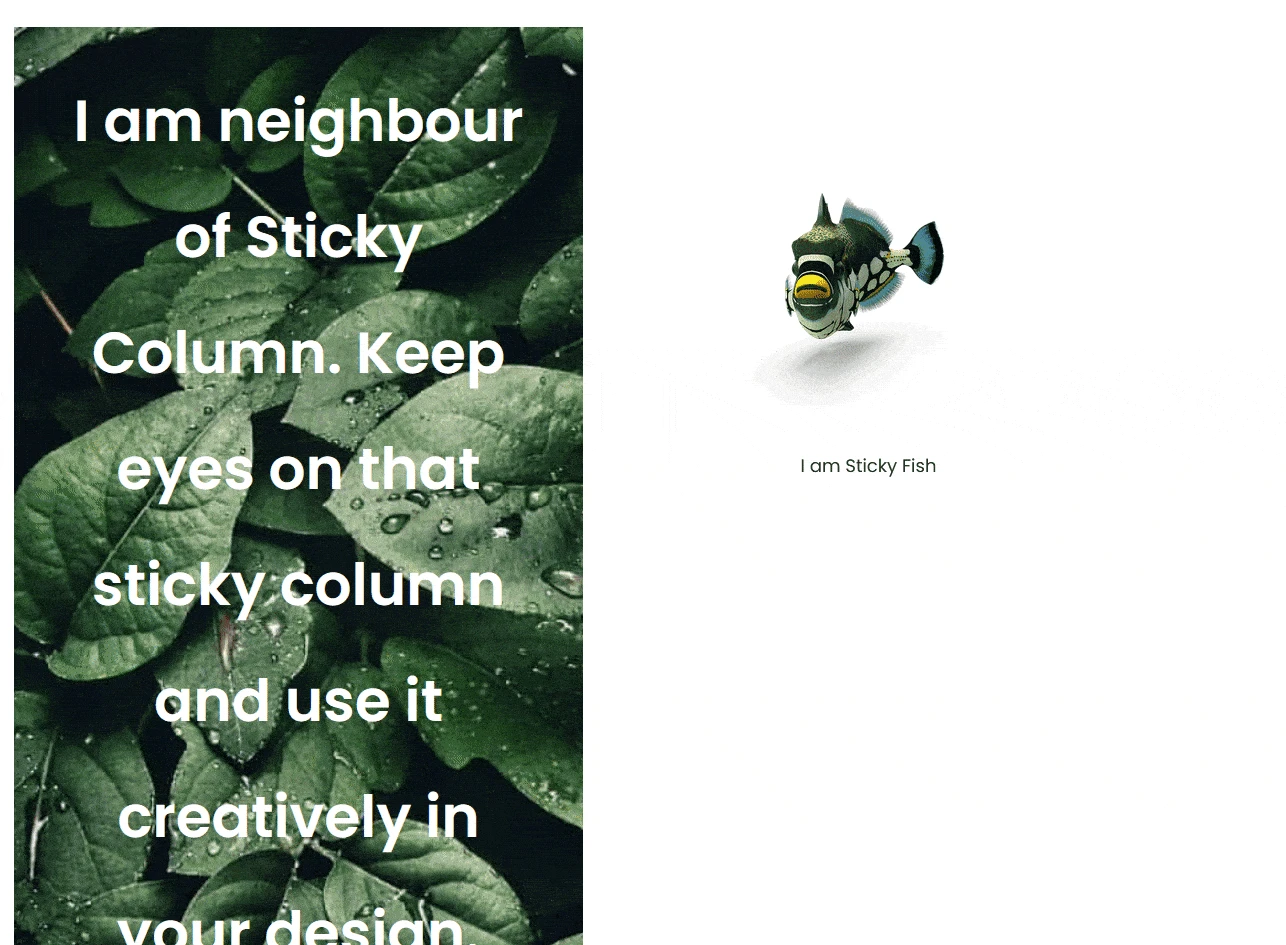
The sticky column effect is now active on the page.

Demo of a sticky column staying fixed while the adjacent column scrolls
A sticky column staying in place while the adjacent column scrolls

Use Cases

  • Blog posts with a sticky table of contents column on the side
  • Landing pages where a pricing summary or CTA button stays visible while the visitor reads a long feature list
  • Service pages where a contact form column remains accessible as the visitor scrolls through details

Limitations

  • Sticky Column must be set on the inner container (the column), not the outer Container block that wraps both columns – enabling it on the wrong level does nothing.
  • The effect requires the sibling column to hold more content than the viewport; a short sibling column means the sticky column never scrolls far enough to visibly detach.
  • Nesting a sticky inner container deep inside other flex/width containers can change how much it expands while stuck – test the live page, not just the block editor preview, after building a non-trivial layout.

Troubleshooting

  • Sticky column stops sticking after further editing, even though it worked before. A real, confirmed report (FluentSupport ticket #14754, Nexter WP) hit exactly this – re-check that the toggle is still enabled on the correct inner container after any structural change, since moving content between containers can change which container the setting is attached to.
  • Sticky column expands or overlaps the other column once it becomes stuck. This points to a width/flex conflict from the block’s own flex layout (stretch/flex-start) rather than the Sticky Column toggle itself – give the sticky inner container an explicit Width value instead of leaving it to flex-grow, so its width does not change between the normal and stuck states.
  • Sticky column works on desktop but not on a specific laptop resolution. Check the Sticky Desktop/Tablet/Mobile breakpoints against the actual screen width of that device – a resolution that falls into the Tablet breakpoint will not stick if Sticky Tablet is left off.

About the Author

Photo of Aditya Sharma CMO of Nexter
CMO at POSIMYTH Innovations · Nexter · 7 years experience

He has spent years in the WordPress ecosystem building, breaking, and optimizing sites until they actually perform. He works at the intersection of speed, growth, and usability, helping creators ship websites that load fast and convert. An active WordPress community contributor sharing through tools, tutorials, and direct collaboration. Tested practice, not theory.

WordPressThemesElementorn8nAIClaudeAutomationServer

Share your Thoughts

Still in Doubt? Let’s Assist You

Have Feedback or Questions?

Join our WordPress Community on Facebook!