How to Use Fluid Typography in WordPress?

Key Takeaways

  • Nexter Blocks allows users to add typography units in Clamp for responsive font sizes based on screen size.
  • Users can generate Clamp code by entering minimum and maximum viewport widths and font sizes on a specific page.
  • The generated Clamp code can be applied in any Nexter Blocks block with typography options to achieve fluid font sizes.
Table of Contents

Typography is one of the most important elements of design, and when used effectively, it can greatly enhance the visual appeal of your website. Fluid typography is a relatively new concept in web design that allows font sizes to adjust automatically based on the screen size of the device being used. This means that your website will look great whether it’s being viewed on a large desktop monitor or a small mobile phone screen.

In Nexter Blocks blocks you can add typography units in Clamp which makes them responsive to changes in screen size or device.

Requirement  – This feature is a part of Nexter Blocks, make sure its installed & activated to enjoy all its powers.

How to Generate Clamp code?

To generate the clamp code go to this link.

Once you are on the page, here you’ll find four fields – 

Minimum viewport width: Here you’ll have to add a minimum screen size.

Minimum font size: Here you’ll have to mention the minimum font size. This will be the minimum font size when the screen size is at the Minimum viewport width.

Maximum viewport width: Here you’ll have to add a maximum screen size.

Maximum font size: Here you’ll have to mention the maximum font size. This will be the maximum font size when the screen size is at the Maximum viewport width.

font size clamp generator

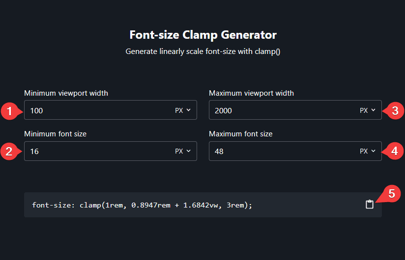
For any viewport size between the maximum and the minimum viewport width, the font size will automatically change according to the viewport width based on the mentioned maximum and minimum font size.

Once you enter the four values it will automatically generate the Clamp code click on the clipboard icon to copy the code.

How to Use the Clamp Code in Nexter Blocks Block?

Once you add a block on the page, for example, the Heading block, go to the Style tab.

In the Title tab, go to Typography click on the settings icon, and select C from the Font Size dropdown.

This will open an input field to add your clamp code.

You can also click on the Generate Clamp Code link to open the Font-size clamp code generator.

Once you have generated the clamp code, copy the code after font-size: till the end. 

For example, the generated code is – “font-size: clamp(1rem, 0.6471rem + 1.8824vw, 3rem);

But you should copy only – “clamp(1rem, 0.6471rem + 1.8824vw, 3rem);

Excluding the “font-size:”.

Back in the editor, paste the code in the Font Size field.

nexter fluid typography

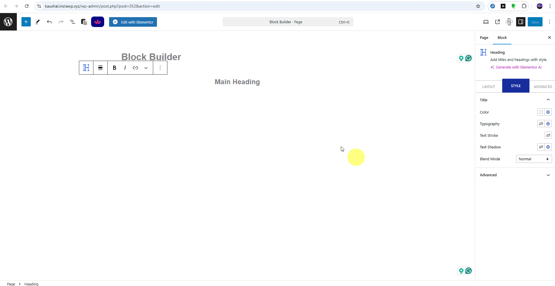
Note: You’ll find this option with any Nexter Blocks blocks with typography options.

Now your font size will be fluid based on the screen size.

About the Author

Photo of Aditya Sharma CMO of NexterWP
CMO at POSIMYTH Innovations · NexterWP · 7 years experience

He has spent years in the WordPress ecosystem building, breaking, and optimizing sites until they actually perform. He works at the intersection of speed, growth, and usability, helping creators ship websites that load fast and convert. An active WordPress community contributor sharing through tools, tutorials, and direct collaboration. Tested practice, not theory.

WordpressThemesElementorn8nAIClaudeAutomationServer

Share your Thoughts

Get Instant Answers to all your questions about Nexter Blocks,
Extensions & Theme trained on 1000+ Docs and Videos

Still in Doubt? Let’s Assist You

Have Feedback or Questions?

Join our WordPress Community on Facebook!

Related Frequently Asked Questions

What if the Clamp code doesn't generate correctly?

If the Clamp code doesn't generate as expected, double-check the values you entered for the minimum and maximum viewport widths and font sizes. Ensure that the minimum viewport width is less than the maximum viewport width. If the values are correct and it still doesn't work, try refreshing the page or clearing your browser cache.

Can I use fluid typography with any Nexter Blocks block?

Fluid typography can be applied to any Nexter Blocks block that includes typography options. This means you can enhance the responsiveness of text in various blocks, such as headings or paragraphs, making your website more visually appealing across different devices.

What are the best practices for setting up fluid typography?

When setting up fluid typography, ensure that your minimum and maximum font sizes are appropriately set to maintain readability. A common practice is to choose a minimum font size that is legible on smaller screens and a maximum size that fits well on larger displays. This approach ensures that your text remains accessible and visually balanced.

How does fluid typography improve user experience?

Fluid typography enhances user experience by ensuring that text is always readable, regardless of the device used. It automatically adjusts font sizes based on screen dimensions, which helps maintain visual consistency and improves accessibility for users on mobile devices.

What happens if I forget to copy the correct part of the Clamp code?

If you forget to copy only the clamp portion of the code and include 'font-size:', the styling may not apply correctly. Ensure you copy just the clamp function, such as 'clamp(1rem, 0.6471rem + 1.8824vw, 3rem);', to avoid any issues with font size rendering.

Last reviewed: April 15, 2026

Related Docs