












A plain grid is still the clearest way to show a set of photos.
The Media Listing block in Nexter Blocks Pro builds one from your Media Library images, with the column count set separately for each screen size.
For every Media Listing setting in one place, see the Media Listing block guide.
Before You Start
- Edition: Pro — the Media Listing block is part of Nexter Blocks Pro.
- Block to enable: Media Listing, switched on under Nexter > Blocks in your WordPress dashboard.
- Your images uploaded: add them to the Media Library first so you can pick them straight from the block.
Steps
- Add the Media Listing block to your page and click Design from Scratch.
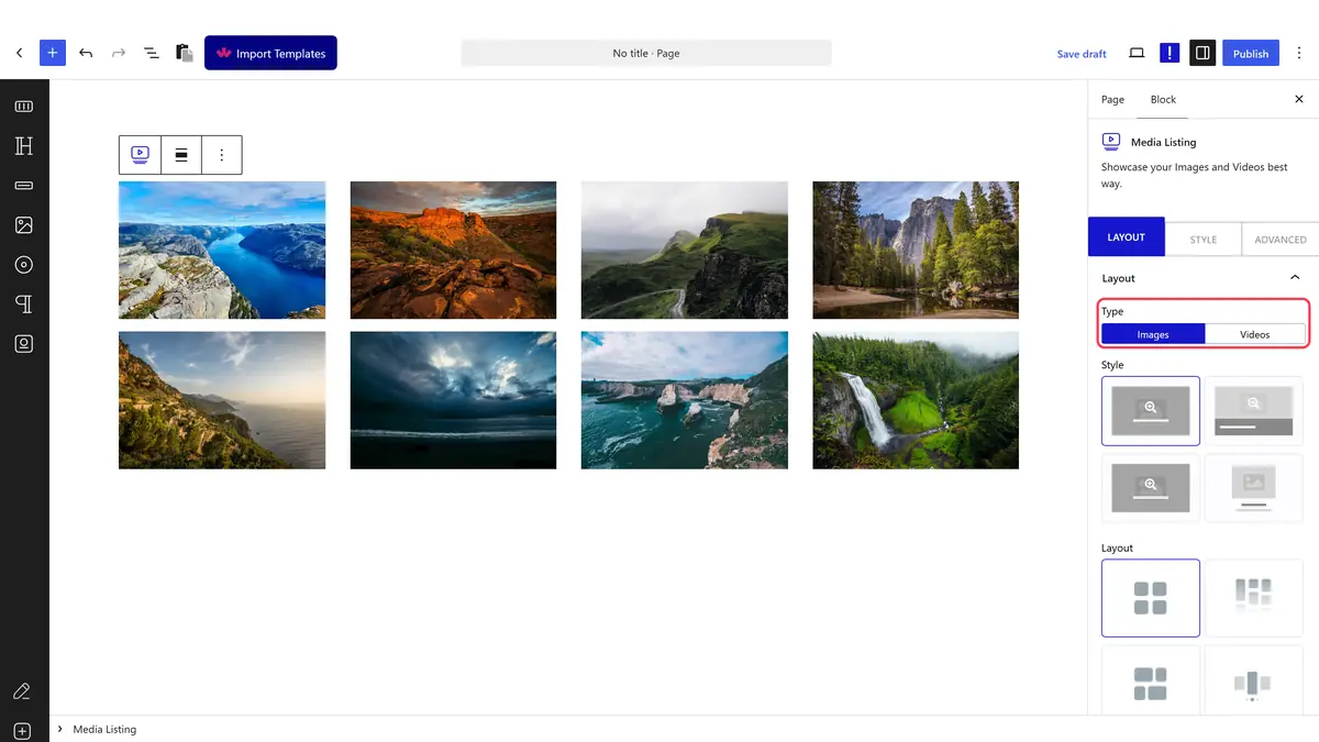
- In the Layout panel, set Type to Images.
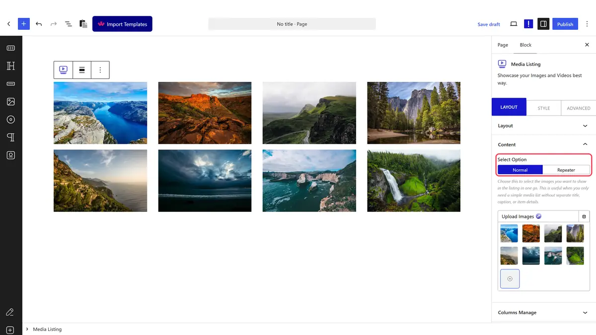
- Open Content, leave Select Option on Normal and pick your images.
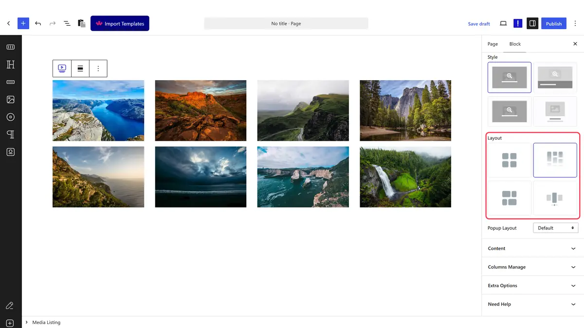
- Still in Layout, set Layout to Grid.
- In Columns Manage, set Columns, then use the device icons to set a smaller count for tablet and mobile.
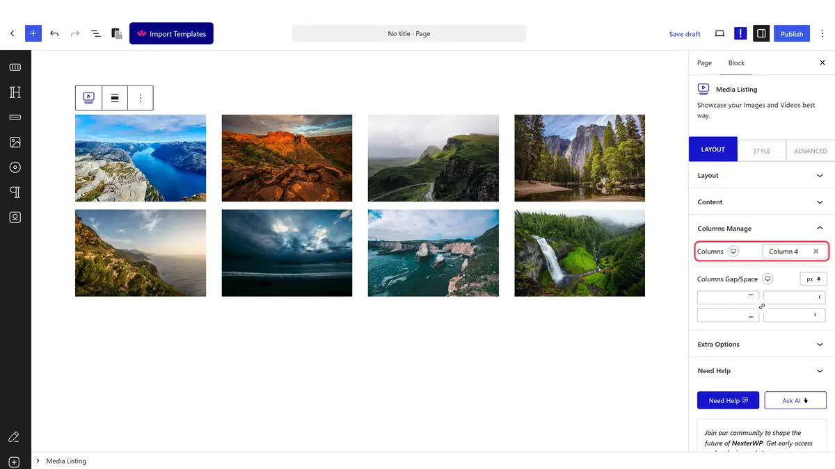
- Adjust Columns Gap/Space for the spacing between tiles, then publish.
How It Behaves
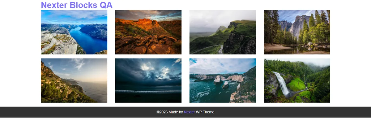
- Every tile in a row is the same height, so rows line up even when the photos are different shapes.
- Each device keeps its own column count, so a four column desktop gallery can show one column on a phone.
- Clicking a photo opens it in the lightbox unless you set Popup Layout to No.
Limitations
- Pro only.
- Tiles are cropped to a shared height, so tall photos lose some of the top and bottom. Use masonry if you want each photo shown whole.
- Grid images added under Normal have no individual titles or links. Switch to repeater content for that.
Troubleshooting
The gallery shows one photo per row
You are looking at the mobile column count. Switch the device icon next to Columns to desktop and set the count there.
Photos look cropped
That is how the grid keeps rows even. Either accept the crop, raise Display Image Size in Extra Options, or switch to masonry.
