One-page navigation lets visitors scroll through a website’s content without switching between multiple pages. This approach improves the user experience and works well for landing pages, portfolios, and product pages where all content lives on a single screen.
With the Scroll Navigation block from Nexter Blocks, you can create single-page scroll navigation in WordPress.
Required Setup
- Make sure the default WordPress Block editor is active.
- You need to have the Nexter Blocks plugin installed and activated.
- This is a Premium block, and you need the PRO version of Nexter Blocks.
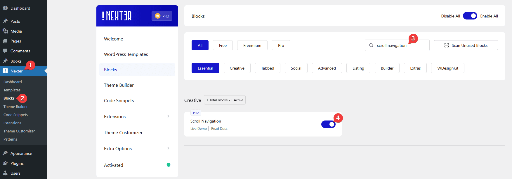
- Make sure the Scroll Navigation block is activated. To verify this, visit Nexter → Blocks and search for Scroll Navigation and activate.
Learn via Video Tutorial
How to activate the Scroll Navigation Block?
Go to
- Nexter → Blocks
- Search the block name and turn on the toggle.

Key Features
- Multiple Style – Choose from multiple pre-defined styles for the navigation dots or icons.
- Tooltip – Add a tooltip to each scroll navigation item so visitors know which section they are navigating to.
- Icon – Add an icon to each navigation item.
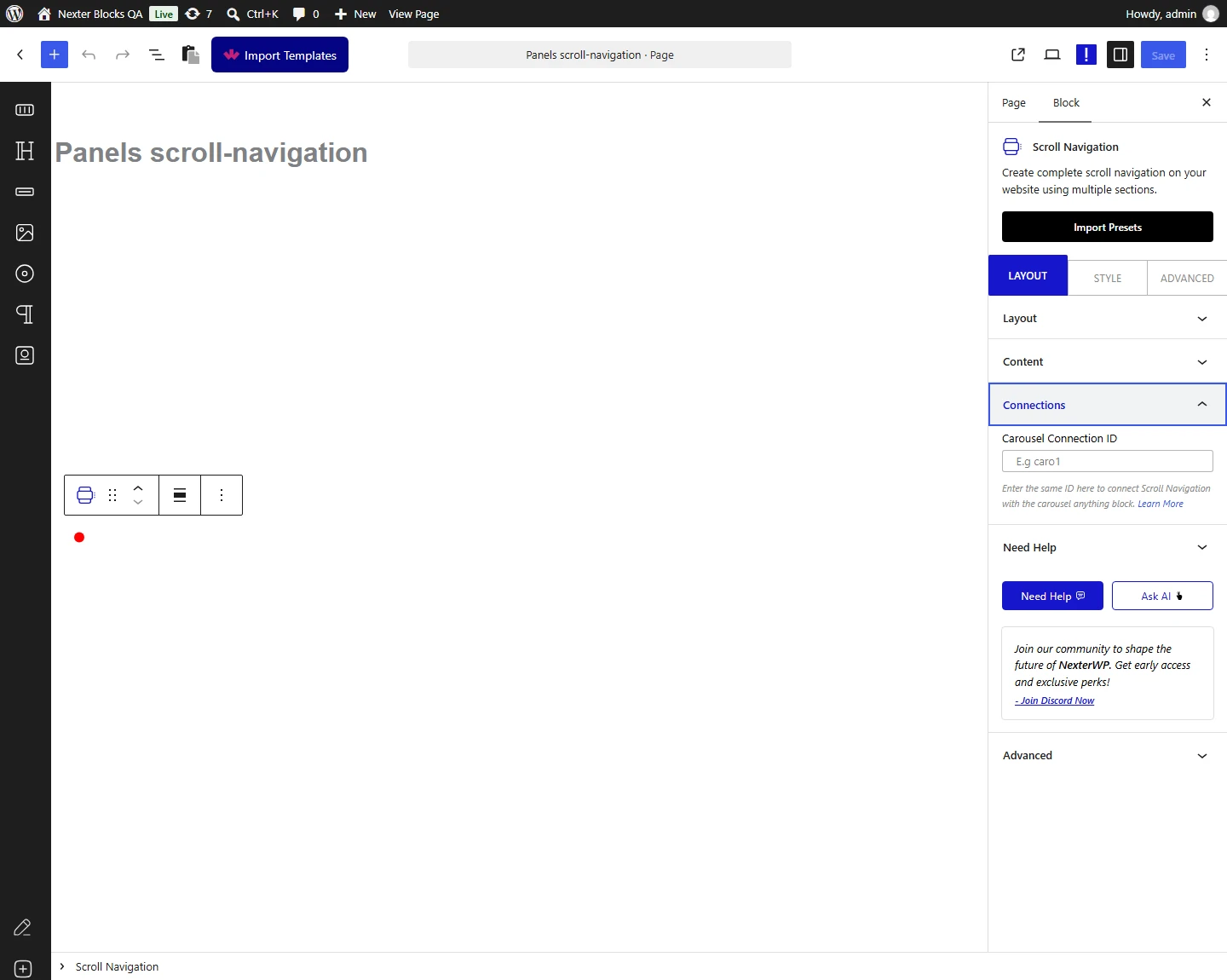
- Carousel Connection ID – Sync the Scroll Navigation block with the Carousel Anything block to control a carousel with scroll navigation dots.
How to Use the Scroll Navigation Block?
First, create top-level sections or containers on the page. Each section or container represents one slide or screen. For five slides, create five top-level sections.
Use the Container block from Nexter Blocks to create the top-level sections.
Note: For the top-level sections, use full-width and full-screen height to provide a good one-page navigation experience.
Add a unique ID to each top-level section or container.
To do this, go to the Advanced tab and enter a unique ID in the HTML anchor field.

Repeat this for each section, making sure every ID is different.
Note: The CSS ID of each top-level section or container must be unique.
Once done, add the Scroll Navigation block to the page.
Click the Design from Scratch button to design the layout from scratch.

Note: By clicking on the Import Pre-Designed Template button, you can import a preset template and customize it as per your requirements.
Layout
From the Select Style section, select a pre-defined style.
You will find 6 pre-defined styles:
- Style 1 – Solid circle navigation items.
- Style 2 – Diamond-shaped navigation items.
- Style 3 – Outline circle navigation items.
- Style 4 – Underlined navigation items.
- Style 5 – Icon-based navigation items.
- Style 6 – Horizontal icon and text-based navigation items.
Select the style that fits your design.
From the Direction section, select the placement of the scroll navigation. The options available will vary based on the selected style.
Note: The Direction option is not available in Style 6.
Enable the Display Counter toggle to show a counter in the scroll navigation.
Note: The Display Counter toggle is only available for Style 2 and Style 4.
From the Tooltip Style section, select how the tooltip appears on the scroll navigation. The three options are:
- On Hover – Shows the tooltip when you hover over the navigation item.
- On Active Section – Shows the tooltip when the current section is active.
- Default – Always shows the tooltip.
Content
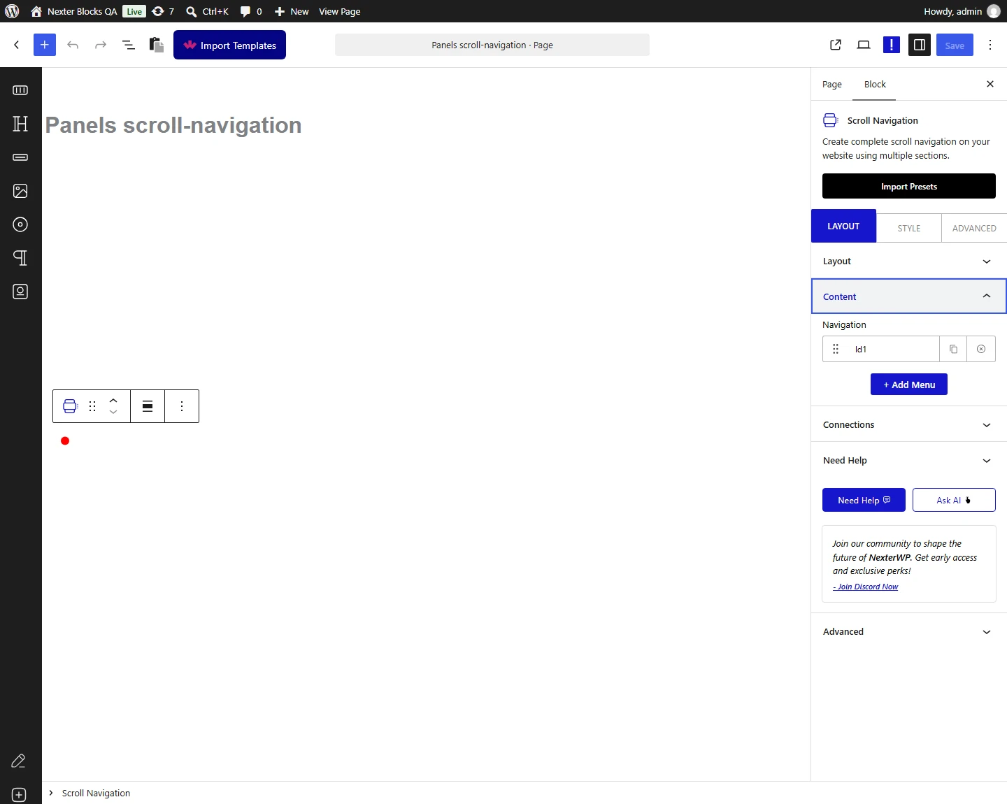
From the Navigation section, add the scroll navigation items. By default, you will find one repeater item. Open it.
In the Section ID field, enter the ID of the top-level section you want to connect to that navigation item.
Connect the first section to the first navigation item, the second section to the second item, and so on.
Enable the Tooltip toggle to add a tooltip to the navigation item.
Enable the Icon toggle to add an icon to the navigation item. The icon will appear alongside the tooltip content.
Note: For Style 5, the icon is used as the navigation item itself.
In the Aria Label field, add an Aria label to improve accessibility for screen readers.
Click the + Add Menu button to add more navigation items.
Add the same number of navigation items as there are top-level sections on the page. If you have 5 top-level sections, add 5 navigation items and assign the respective section IDs to each.
Connections
From the Carousel Connection ID section, connect the Scroll Navigation block with the Carousel Anything block from Nexter Blocks.

How to Style the Scroll Navigation Block?
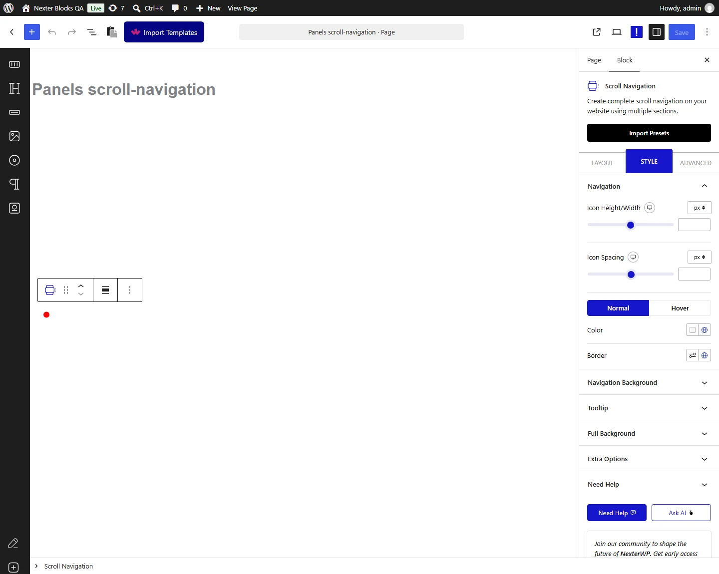
To style the Scroll Navigation block, go to the Style tab.
Navigation – Controls the navigation item width, height, spacing, and color.

Navigation Background – Adds a background, border, and border radius to the navigation items for normal and hover states.
Tooltip – Controls the style of the navigation item tooltip.
Display Counter – Appears only when the Display Counter toggle is enabled for Style 2 and Style 4. Controls the style of the display counter.
Full Background – Adds a background, border, box shadow, padding, and offset to the entire scroll navigation container.
Extra Options – Contains additional options:
- Visible on Scroll – Enable this toggle to set a top offset value in pixels. The scroll navigation will only appear after the user scrolls down by that number of pixels.
Advanced options are shared across all Nexter Blocks. You can explore all their options from the Advanced tab documentation.