How to Create a Polar Area Graph in WordPress?

Key Takeaways

  • Nexter Blocks includes the Advanced Chart block, enabling users to create polar area charts on their WordPress website.
  • Users can customize the polar area chart by adding chart labels and dataset values separated by a pipe sign (|).
  • The Style tab in the Advanced Chart block offers customization options similar to those available for the Line chart.
Table of Contents

Are you looking to create a polar chart from your data in WordPress? A polar area chart is a powerful visual tool that displays multiple data points in a circular format, allowing for effective comparisons and insights in your data presentation.

With the Advanced Chart block from Nexter Blocks, you can easily create a polar chart from your data on your WordPress website.

To check the complete feature overview documentation of the Nexter Blocks Advanced Chart block, click here.

Requirement  – This block is a part of the Nexter Blocks, make sure it’s installed & activated to enjoy all its powers.

To do this, add the Advanced Chart block to the page and follow the steps – 

1. Select Polar Area from the Style section under the Chart tab.

advanced chart polar area style new

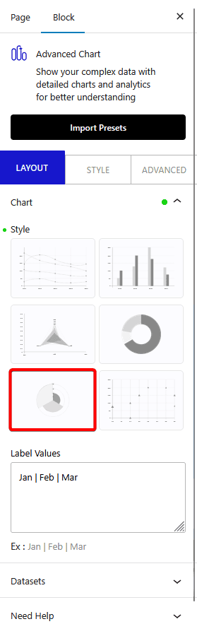
2. After that, in the Label Values field, you have to add chart labels separated by a pipe sign (|).

3. Then in the Dataset tab, you have to add the data for the chart. You’ll find the same options as for the Line chart.

You can customize the chart further from the Style tab. Here you’ll find the same options that are available for the Line chart.

Now you should have an interactive polar area graph.ge the individual dataset border color. To do so, you have to add the color hex codes separated by a pipe sign (|). Make sure to add the same number of colors as added in the Data field. 

About the Author

Photo of Aditya Sharma CMO of NexterWP
CMO at POSIMYTH Innovations · NexterWP · 7 years experience

He has spent years in the WordPress ecosystem building, breaking, and optimizing sites until they actually perform. He works at the intersection of speed, growth, and usability, helping creators ship websites that load fast and convert. An active WordPress community contributor sharing through tools, tutorials, and direct collaboration. Tested practice, not theory.

WordpressThemesElementorn8nAIClaudeAutomationServer

Share your Thoughts

Get Instant Answers to all your questions about Nexter Blocks,
Extensions & Theme trained on 1000+ Docs and Videos

Still in Doubt? Let’s Assist You

Have Feedback or Questions?

Join our WordPress Community on Facebook!

Related Frequently Asked Questions

What should I do if my polar area chart is not displaying correctly?

If your polar area chart isn't displaying as expected, check the data input in the Dataset tab. Ensure that the values are correctly formatted and that the number of colors matches the number of data points. Each dataset should have a corresponding color hex code, separated by a pipe sign (|). This ensures that the chart renders properly without errors.

What is the best way to label my polar area chart?

For optimal clarity, label your polar area chart by entering labels in the Label Values field, separated by a pipe sign (|). This method helps in organizing the data points effectively, making it easier for viewers to interpret the chart. Proper labeling is crucial for enhancing the readability of your visual data.

Does the Advanced Chart block require any specific plugins to work?

The Advanced Chart block is part of Nexter Blocks, so you must have it installed and activated to use this feature. Without Nexter Blocks, you won't be able to access the polar area chart functionality or any other chart types offered by this block.

What happens if I forget to add colors for my dataset in the polar area chart?

If you forget to add color hex codes for your dataset, the polar area chart may not display correctly or may use default colors that don't match your design. It's essential to add the same number of colors as data points to ensure each segment of the chart is visually distinct and aligned with your overall site aesthetics.

Are there any limitations when using the Advanced Chart block for polar area graphs?

While the Advanced Chart block is powerful, it does have limitations in terms of customization options compared to dedicated charting libraries. For instance, advanced animations or interactivity features may not be available. Understanding these limitations can help you decide if this block meets your specific data visualization needs.

Last reviewed: April 14, 2026

Related Docs