


Adding social sharing buttons to a page gives visitors an easy way to share your content across social media platforms, which expands your content’s reach without any additional promotion effort on your part.
With the Social Sharing block from Nexter Blocks, you can add social sharing buttons to any WordPress page or post.
Best Used For:
- Blog posts where reader sharing is a primary traffic source
- News and editorial pages where social reach amplifies content distribution
- Product pages where social proof sharing reinforces buying decisions
Required Setup
- Make sure the default WordPress Block editor is active.
- You need to have the Nexter Blocks plugin installed and activated.
- This is a Premium block, and you need the PRO version of Nexter Blocks.
- Make sure the Social Sharing block is activated. To verify this, visit Nexter → Blocks → and Search for Social Sharing and activate.
Learn via Video Tutorial:

How to activate the Social Sharing Block?
Go to
- Nexter → Blocks
- Search the block name and turn on the toggle.

Key Features
- Three Layouts – Choose from Horizontal, Vertical, and Toggle layouts. Use the Vertical layout when you want to create sticky social icons fixed to the side of the page. Use the Toggle layout when you want a single button that expands to reveal the share options on click.
- Multiple Styles – Select from multiple preset styles for each layout to match your site’s visual design without custom CSS.
- Fake Share Counter – Display a custom total share count that you set manually. Use this on new content where real share counts are low but you want to signal social credibility to visitors.
How to Use the Social Sharing Block?
Add the Social Sharing block to the page.
From the Layout section, select the layout you want to use. The three options are:
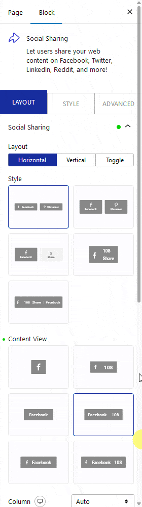
- Horizontal – Aligns the social icons in a row. Use this for inline share bars at the top or bottom of a post.
- Vertical – Aligns the social icons in a column. Use this to create sticky social icons fixed to the side of the page.
- Toggle – Shows a single button that expands to display all share options on click. Use this when the page is content-dense and you want to save space.
Select the option that fits your layout.
From the Style section, select a predefined visual style for the buttons.
From the Content View section, select what appears on each social button. The six options are:
- Icon – Shows only the social network icon.
- Icon Count – Shows the icon with a share counter.
- Text – Shows only the network name as text.
- Text Count – Shows the network name with a share counter.
- Icon Text – Shows the icon and the network name together.
- Icon Text Count – Shows the icon, network name, and share counter together.
Select the option that matches the amount of information you want to display on each button.
From the Column dropdown, set the number of columns for the social icon grid. Use this when you have several social networks and want them arranged in a compact multi-column format.
From the Block Alignment section, align the social icon group horizontally for each responsive breakpoint.
From the Content Alignment section, align the content within each individual button.
Enable the Display Counter toggle to show a total share count across all networks. Enter the count value you want to display in the number field that appears.
In the Networks section, add and configure each social icon. Open one item at a time.
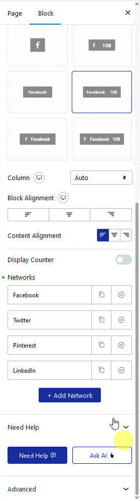
From the Social Network dropdown, select the social platform for that button.
In the Title field, add the button label text. This appears on the button when the Content View includes text.
In the Count Number field, enter a custom share number for that specific network. Use this to show platform-specific share counts when you track them manually.
In the Count Label field, add a label that appears next to the count number, such as “shares.”
In the Social Button field, add extra text that appears after the counter number on the button.
Note: The visibility of the Title, Counter Number, Count Label and Social Button on the front end will depend on the selected button View Type.
Enable the Custom URL toggle to set a custom link for that social button instead of using the current page URL. Use this when you want to track shares on a specific URL or redirect shares to a canonical URL.
In the Aria Label field, add an accessible label for the social icon. This label is read by screen readers and improves accessibility for visitors using assistive technology.
From the Normal and Hover tab sections, set the title color, icon color, counter number color, counter label color, border color, and background for each network button in its resting and hover states.
Edit the remaining network items in the same way.
Click the + Add Network button to add more social sharing buttons to the block.
How to Style the Social Sharing Block?
To style the Social Sharing block, go to the Style tab. The available styling options change depending on the selected layout and content view type.
Title – Controls the typography and color of the network name text on each button. Use this when the Content View type includes text labels.
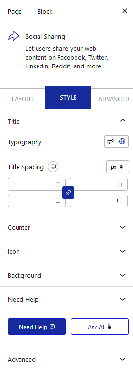
Counter – Controls the typography and color of the share count number. This option is available when the Content View type includes a counter.
Icon – Controls the size and container width of the social icons. Use this to scale the icons up or down to match the surrounding content.
Toggle – Controls the appearance of the expand button. This option is visible only when Toggle is the selected layout.
Total Counter – Controls the typography and color of the total combined share count. This option is visible only when the Display Counter toggle is enabled.
Background – Controls the width, height, and background color or image of the container that holds all the social buttons.
These Advanced settings are shared across all Nexter Blocks.
