


Interactive circles add engaging elements to your WordPress site and serve a range of purposes, from visualizing data to presenting call-to-action sequences.
The Interactive Circle Info block in Nexter Blocks lets you add interactive circle infographics to your WordPress website.
Best Used For:
- Service or product pages that showcase multiple offerings in a compact, visually organized circle layout
- Portfolio and agency sites that need interactive infographics to present processes or workflows
- Landing pages where click or hover interactions help guide visitors through staged content without scrolling
Required Setup
- Make sure the default WordPress Block editor is active.
- You need to have the Nexter Blocks plugin installed and activated.
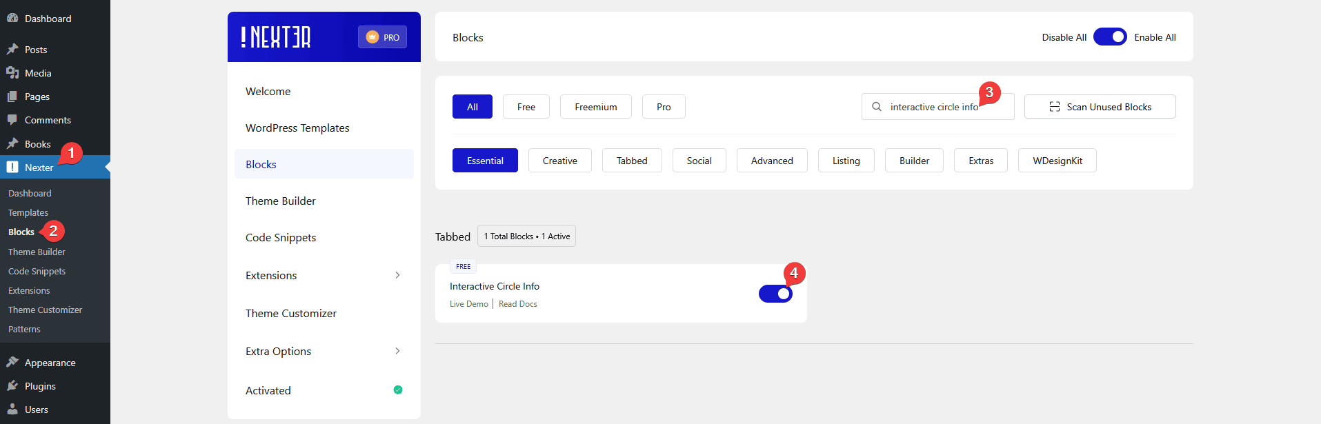
- Make sure the Interactive Circle Info block is activated, to verify this visit Nexter → Blocks → and Search for Interactive Circle Info and activate.
Learn via Video Tutorial

How to activate the Interactive Circle Info Block?
Go to
- Nexter → Blocks
- Search the block name and turn on the toggle.
Key Features
- Three Triggers – You will find three triggers to switch between items on hover, on click, and auto. Use hover for desktop-first layouts where users naturally move the cursor over the circle, and use click for touch-friendly or mobile-priority designs.
- Carousel Anything Connection – You can connect the interactive circle with the carousel anything block.
How to Use the Interactive Circle Info Block?
Add the Interactive Circle Info block from Nexter Blocks to the page.
Then click on the Design from Scratch button to design the layout from scratch.
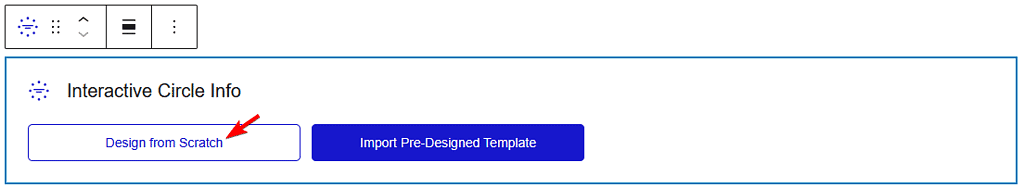
Note: By clicking on the Import Pre-Designed Template button, you can import a preset template and customize it as per your requirements.
Content
By enabling the Display Button toggle, you can show buttons in the interactive circle info items.
When enabled, you can select from different pre-defined styles.
From the Alignment section, you can align the content in the interactive circle for different responsive devices.
In the Interactive Circle section, add the content. Three repeater items appear by default — open one item.
From the Content Type section, you can manage the circle button and the content of the item.
Button Tab
From the Icon Type section, add an icon or image to the circle button.
Then, in the Title field, add a title to the circle button.
After that, you will find different styling options to manage the circle button icon, title, background and border style for normal, hover and active status.
Content Tab
From the Title field, you can add a title to the content.
In the Description section, you can add a description to the content.
Then, in the Button Text field, you can add a text for the button in the content.
In the Button Link section, you can add a link to the button.
Note: You’ll see the button related fields only when the Display Button toggle is enabled.
After that, you will find different styling options to manage the title, description, background, and border style for normal, hover, and active status.
Similarly, you can edit the remaining items.
You can click on the + Add Item button to add more repeater items.
Extra Options
From the Trigger section, you can choose how to change the interactive circle content. Here you will find three options –
- Hover – To change the content on circle button hover. Use this for desktop-focused pages where the cursor movement is part of the intended interaction.
- Click – To change the content on circle button click. Use this for mobile-friendly designs where tap interactions are more reliable than hover.
- Auto – To change the content automatically on a timed interval. Use this for unattended displays or pages where you want to cycle through all items without user interaction.
Select the option as per your requirements.
Then, from the Default Active dropdown, you can set any particular circle item to be active by default.
By enabling the Out Animation toggle, you can set different loading animations for the interactive circle.
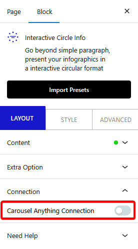
Connection
This tab will be visible only if you set the trigger to Hover or Click from the Extra Options tab.
From the Carousel Anything Connection toggle, you can connect the Interactive Circle Info block with the Carousel Anything block.
To add a full carousel that cycles through multiple content panels, see How to Add a Carousel Anything Slider in WordPress. For a compact info display without the circular layout, the Infobox block is a straightforward alternative.
How to Style the Interactive Circle Info Block?
To style the Interactive Circle Info, you will find all the options in the Style tab.
Circle – From here, you can style the main circle.
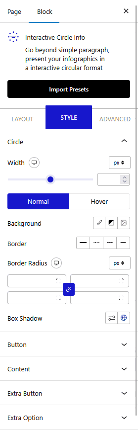
Button – From here, you can style all the circle buttons at once.
Content – From here, you can style all the circle content at once.
Extra Button – This tab appears only when the Display Button toggle is enabled from the Layout tab. From here, you can style the buttons in the interactive circle content.
Extra Options – From here, you can add indicators to the circle buttons and auto-rotate the circle buttons around the circle.
Advanced options are common across all Nexter blocks and control spacing, visibility, motion effects, and more.
