


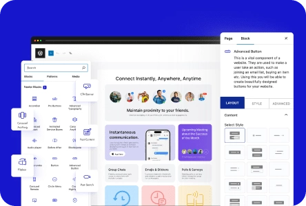
A flip box is a dynamic content card that reveals additional information when the user hovers over it, making it an effective way to showcase products, services, or team members without cluttering the page.
With the Flipbox block from Nexter Blocks, you can add different types of flip boxes to your WordPress website using the WordPress Block editor (Gutenberg).
Best Used For:
- Team pages for agencies wanting to show a name and role on the front with a bio and social links on the back
- SaaS product pages showcasing feature cards where the front states the benefit and the back explains how it works
- Portfolios with project cards that reveal a description, tools used, or a link to the live project on hover
Required Setup
- Make sure the default WordPress Block editor is active.
- You need to have the Nexter Blocks plugin installed and activated.
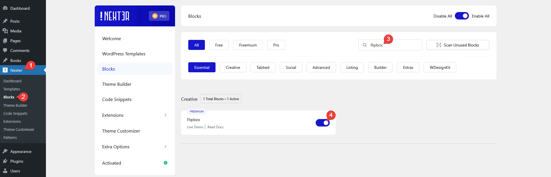
- Make sure the Flipbox block is activated. To verify this, visit Nexter → Blocks, search for Flipbox, and activate it.
- This is a Freemium block. To unlock the extra features, you need the PRO version of Nexter Blocks.
Learn via Video Tutorial

How to activate the Flipbox Block?
Go to
- Nexter → Blocks
- Search the block name and turn on the toggle.
Key Features
- Two Layouts — Select between Grid and Carousel layouts. Use Grid when you want a static listing of flip cards, and use Carousel when you have more cards than fit the row and want users to scroll through them.
- Two Flip Types — Select between Horizontal and Vertical flip types. Use Horizontal for a standard left-to-right card turn. Use Vertical when your front and back content has a natural top-to-bottom relationship, such as a question on the front and an answer on the back.
How to Use the Flipbox Block?
Add the Flipbox block from Nexter Blocks to the page.
Then click on the Design from Scratch button to design the layout from scratch.
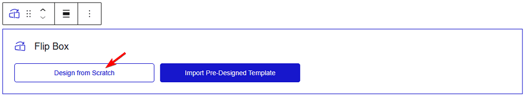
Note: By clicking on the Import Pre-Designed Template button, you can import a preset template and customize it as per your requirements.
From the Select Layout section, select the layout. Here you will find two options:
- Grid — To create a flip box listing.
- Carousel — To create a flip box carousel.
Select the option as per your requirements. Let’s select Listing here.
Then from the Flip Type section, select the flip type. Here you will find two options:
- Horizontal — To create a horizontal flip box.
- Vertical — To create a vertical flip box.
Select the option as per your requirements. Let’s select Horizontal here.
From the Box Height section, set the flip box height. Use this when your front and back content have significantly different text lengths, so the box does not resize on flip and shift surrounding content.
In the Front Side tab, add content on the front side of the flip box.
In the Main Title field, add a title for the front face of the card.
From the Icon Type section, select the icon type. Here you will find four options:
- None — No icon will be added to the flip box.
- Icon — To add a standard icon from the icon library to the flip box.
- Image — To add a custom image to the flip box.
- SVG — To add an animated SVG image to the flip box. Use this when you want the icon to animate on hover for a more interactive feel.
Note: The SVG images will animate in the flip box. For custom SVG, you have to check the compatibility of the SVG file using Vivus Instant. If the SVG animates, it is good to use, but if it does not animate, you have to modify the SVG file and test again.
Based on your selection, you will get different options to add the relevant image.
In the Back Side tab, add content on the back side of the flip box.
In the Description section, add a description for the back face of the card.
By enabling the Button toggle, you can add a button to the flip box. Use this when the flip box back needs a direct call to action, such as a product page link or a contact form.
When enabled, select a button style from the Style section.
From the Text field, edit the button label.
In the Link field, add the URL the button points to.
For a related interactive card block, see how to add animated service boxes in WordPress. For a hover-based card with custom layout options, see how to create hover card animation in WordPress.
How to Style the Flipbox Block?
To style the Flipbox block, find all the options under the Style tab. The styling options will vary based on the selected layout type.
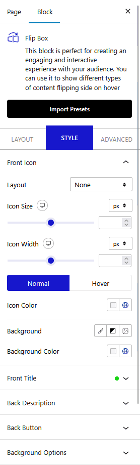
Front Icon — You will see this option only when Icon is selected as the icon type. From here, style the icon in the flip box.
Front Image — You will see this option only when Image is selected as the icon type. From here, style the image in the flip box.
Front SVG Icon — You will see this option only when SVG is selected as the icon type. From here, style the SVG in the flip box.
Front Title — From here, style the front side title of the flip box.
Back Description — From here, style the back side content of the flip box.
Back Button — You will see this option only when the Button toggle is enabled in the Back Side tab. From here, style the button on the flip box.
Background Options — From here, style the background of the flip box. Use this to set different background colors or images for the front and back faces.
Carousel Options — This option is visible when you use the Carousel layout. Here you will find many options to control the carousel.
- Slider Mode — Choose your slider orientation, Horizontal or Vertical.
- Slide Speed — Control the slide transition speed.
- Columns — Set the number of columns for the slide for desktop, tablet, and mobile separately.
- Active Slide — Select any slide to be the active slide when the page loads.
- Next Previous — Set the behavior of next/previous slide movement. Move one column at a time or all visible columns.
- Columns Gap — Adjust the gap between slides.
- Draggable — Make your carousel draggable or non-draggable.
- Infinite Mode — Turn your carousel into an infinite loop slider.
- Pause On Hover (Pro) — Allow users to pause the slider on mouse hover. Use this when your carousel autoplays and you want users to read each card fully before the next one appears.
- Autoplay — Make your carousel slider autoplay and adjust its speed.
- Show Dots (Freemium) — Add dot navigation to the slider and style them.
- Show Arrow (Freemium) — Add arrow navigation for the carousel slider and style them.
- Center Mode (Pro) — Choose the center position of your slider. Use this when you want the active slide to appear centered with partial views of adjacent slides on each side.
- Wheel Navigation — Navigate the slider with the mouse wheel.
- Keyboard Navigation — Navigate the slider with the keyboard.
- Auto Scroll — Make the slide auto scroll.
Advanced options remain common for all Nexter Blocks blocks. You can explore all the options from here.
