






Key Takeaways
- The 2026 web design trends designers keep naming are bold dopamine color, oversized expressive type, motion and guided scrolling, tactile maximalist layering, and radical brevity.
- You can build almost all of them with core Gutenberg blocks: color palettes in Styles, fluid typography, Cover and Group backgrounds, duotone, and the Details block.
- Where core stops, such as parallax, hover animation, and layered sections, Nexter Blocks adds free and pro blocks that stay native to the editor.
- Building trends in blocks instead of a locked-in page builder keeps your site lighter and far easier to restyle when the trend fades.
- Pick one or two trends that fit your brand. Chasing all of them at once hurts clarity, load speed, and Core Web Vitals.
Open any web design trends 2026 roundup and you will see the same thing: gorgeous screenshots of oversized type, candy-bright color, and buttery scroll effects. What almost none of them tell you is how to build any of it on your own site.
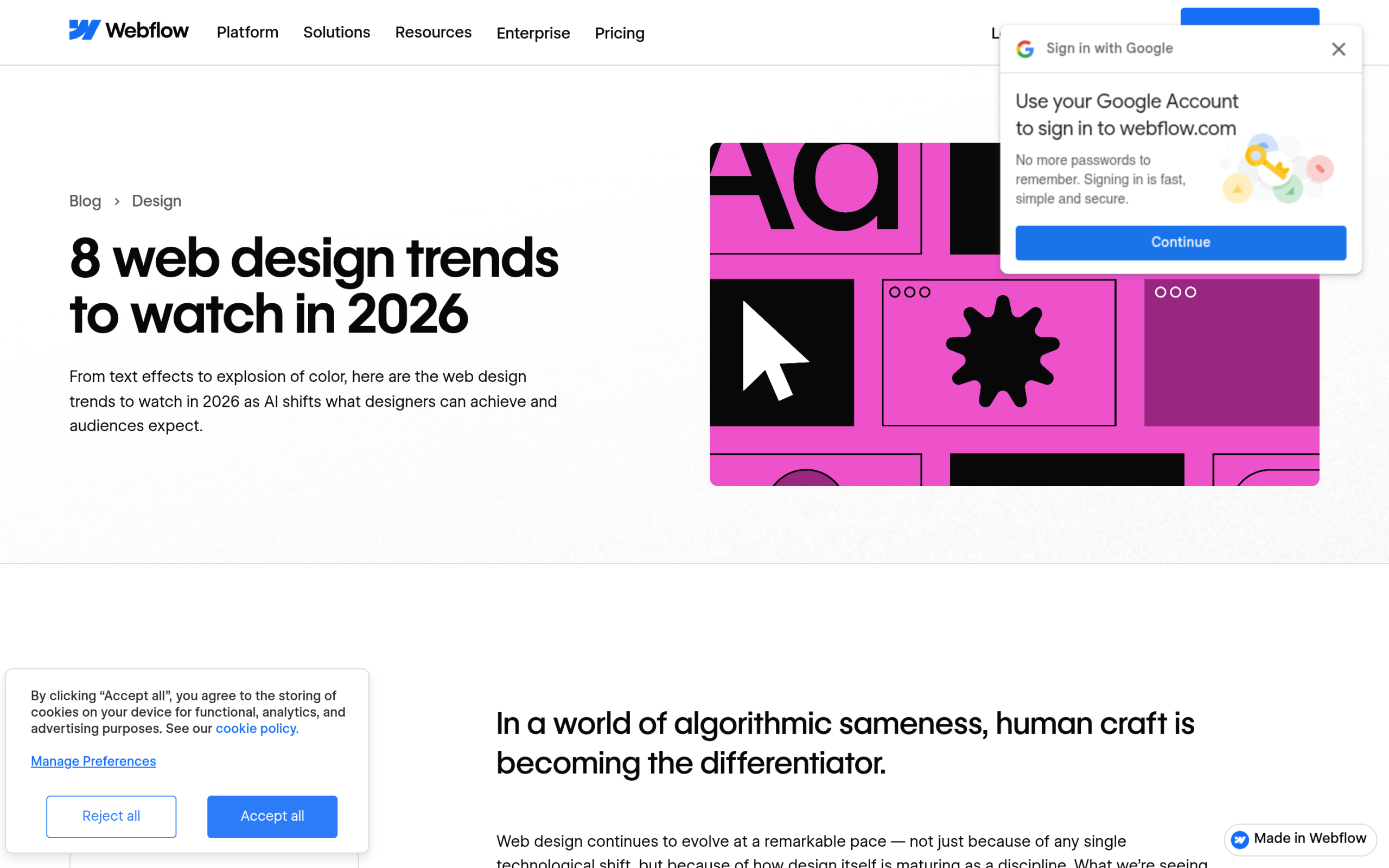
That gap is the reason for this guide. Below are the trends that keep showing up across the design world for 2026, pulled from named sources like Webflow and Wix. For each one you get a plain description of what it is and, more useful, exactly how to build it in Gutenberg, the WordPress block editor, using core blocks first and Nexter Blocks where core runs out of road.
You do not need a separate page builder for any of this. The block editor in 2026 is far more capable than most trend articles assume.
Why build 2026 trends in Gutenberg, not a page builder
Design trends have a short shelf life. The dopamine color scheme that feels fresh in January can feel dated by the next year. That is the real argument for building them in the block editor: when the trend passes, you restyle in minutes from one place instead of unpicking a heavy page-builder layout.
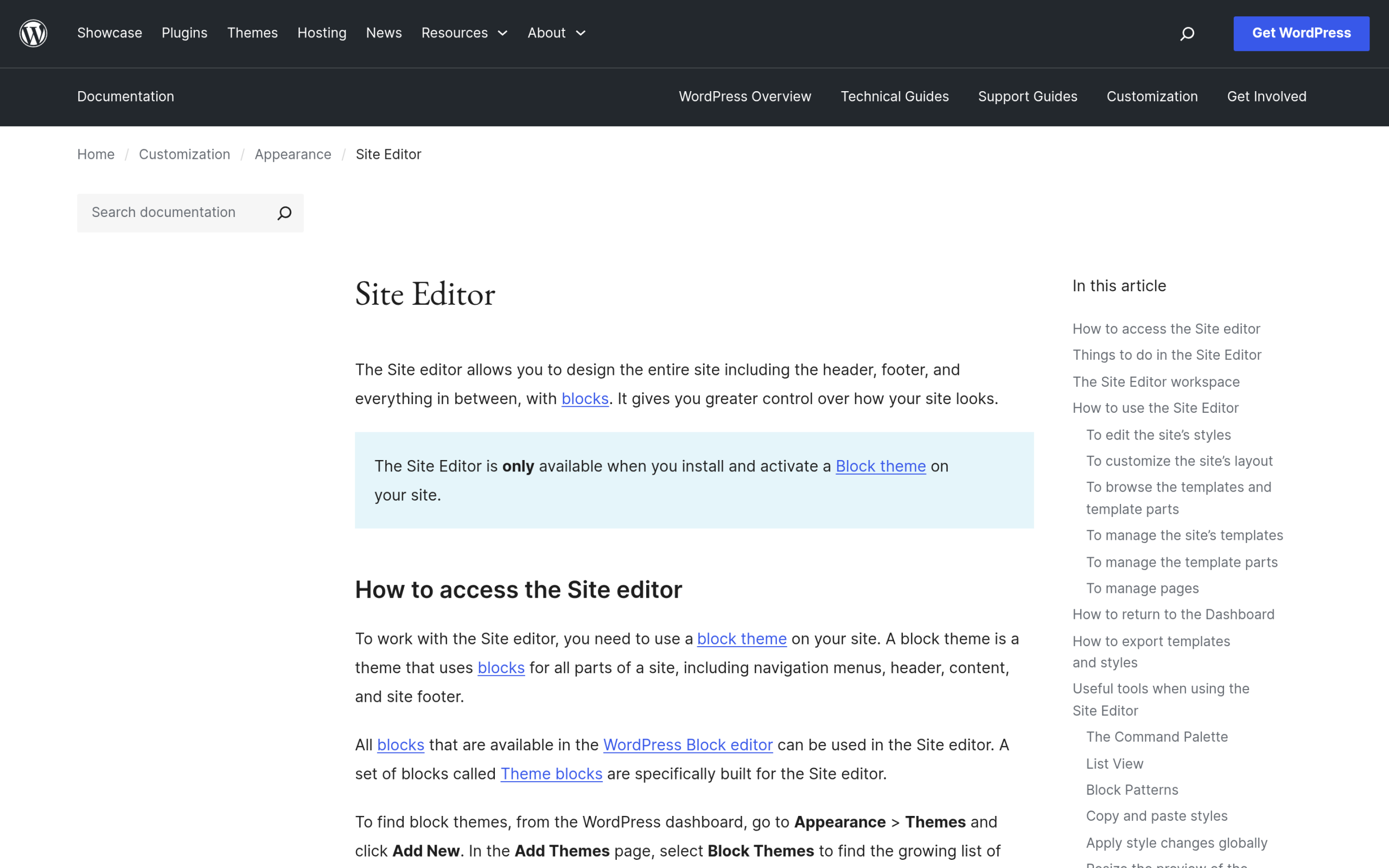
The WordPress Site Editor lets you set colors, fonts, and spacing globally through Styles and the theme.json file. Change a palette once and it updates every block across the site. Block themes also start lighter than most page-builder stacks, which matters because trend effects like animation and large imagery add weight fast. If you want the background on that, our guide to Gutenberg Core Web Vitals on a block theme covers the speed side in detail.
Core blocks handle most of what you need. Nexter Blocks, a free library of more than 90 Gutenberg blocks, fills the gaps for the effects core does not ship yet. We call out where each one helps below. If you are weighing the editor against a page builder first, see our honest Gutenberg vs Elementor comparison and the rundown of the block builders in WordPress 7.
Trend 1: Bold, dopamine color (and earthy counterpoints)
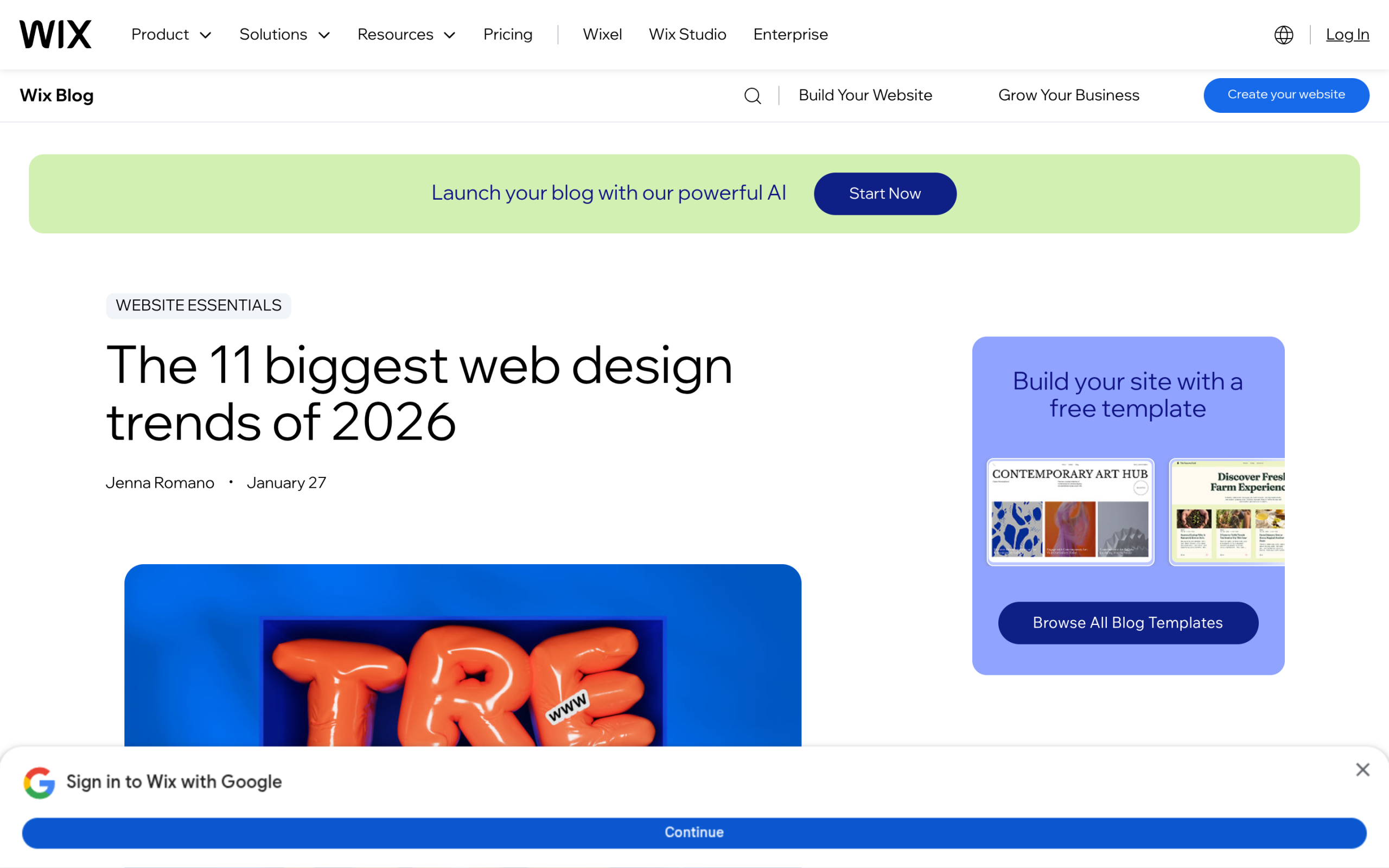
Webflow calls it an explosion of color. Wix calls it dopamine colors. Either way, 2026 leans loud: saturated brights, unexpected pairings, and confident gradients. Running alongside it is a quieter movement Wix labels nature distilled, built on muted, earthy tones. Wix points to the Pantone Color of the Year 2026, Cloud Dancer, a soft off-white, as a signal of that calmer direction. Both can live on the same site if you use one as the base and the other as the accent.
How to build it in Gutenberg:
- Open Styles in the Site Editor and define your palette once. Every block picks from those swatches, so your color stays consistent and is trivial to swap later.
- Use the Cover block or a Group block with a background color or gradient for full-width color sections. The gradient picker is built in, so you can create the smooth blends the trend calls for without any CSS.
- Apply a duotone filter to photos from the block toolbar to tint images into your brand colors, a fast way to make stock or mixed imagery feel deliberate.
- For richer section treatments, the Nexter Blocks Section Background block (pro) adds layered color, gradient, and overlay options on top of the core controls.
Also Read: Gutenberg vs Elementor if you are deciding which tool to build these trends with in the first place.
Trend 2: Oversized, expressive typography
Type is doing the heavy lifting in 2026. Wix describes an exaggerated hierarchy, where dramatically oversized headlines sit next to tiny supporting text for contrast. Webflow points to dynamic text treatments, type used as a design element in its own right rather than plain copy on a background.
How to build it in Gutenberg:
- Set large heading sizes directly in the block’s Typography panel. Turn on fluid typography in theme.json so a giant headline scales down gracefully on phones instead of breaking the layout.
- Push contrast with the built-in controls: letter spacing, line height, text transform for all caps, and the drop cap toggle on the Paragraph block.
- Add a personality typeface through the Font Library, which lets you upload or install custom fonts without touching code, then apply it to your display headings only.
- Keep body text small and calm so the oversized headings carry the drama. That contrast is the whole point of the trend.
Trend 3: Motion and guided scrolling
Webflow highlights guided scrolling, where the page gently directs your eye as you move down it. Wix talks about animation that mimics the physical world, buttons that feel pressable and elements that react as you scroll. Motion, used with restraint, is one of the clearest 2026 signals.
How to build it in Gutenberg:
- Start with what core gives you free: a sticky Group block for a header or callout that stays in view, and a Cover block with a fixed background for a simple parallax feel.
- Core motion stops there, so this is where Nexter Blocks earns its place. The Parallax Background block (pro) adds true scroll parallax to any section.
- The Hover Card Animations block (free) adds tasteful lift and reveal effects to cards on hover, and Animated SVG Icons (free) bring small icons to life without a heavy animation library.
- Keep it light. Every animation adds work for the browser, so test scroll performance on a mid-range phone before you ship.
Trend 4: Tactile maximalism and layered depth
After years of flat minimalism, Wix sees a swing to tactile maximalism, more is more, with layered elements, texture, and a sense of depth. Webflow frames a related idea as proprietary effects, ownable visual treatments that make a site feel crafted rather than generated. The common thread is layering: things stacked, overlapping, and given dimension.
How to build it in Gutenberg:
- Stack a Cover block’s overlay over an image, then place headings and buttons on top, to get layered depth with only core blocks.
- Nest Group blocks with different backgrounds and use negative margins from the Dimensions panel to make sections overlap.
- Add borders, radius, and box shadow through the block’s border and style supports so cards feel raised off the page.
- For interactive depth, the Nexter Blocks Flipbox block (freemium) flips a card to reveal a second side, and the Container block (freemium) gives you flexible, stackable layout wrappers beyond the core Group.
Also Read: How to migrate from Elementor to Gutenberg if you want these effects on a site that is still locked into a page builder.
Trend 5: Radical brevity and the TL;DR layout
When anyone can generate walls of text in seconds, saying less becomes the bold move. Webflow calls this minimalism in copy, along with a TL;DR experience: structured overviews that let people scan first and dig in only where they want to. This is one trend that also helps you get quoted by AI answer engines, which favor clear, scannable structure.
How to build it in Gutenberg:
- Give content room to breathe with the spacing and block gap controls. Generous white space is the whole aesthetic, and it is a setting, not a plugin.
- Use the native Details block to create expandable sections, so a page shows a short summary and hides the depth until a reader asks for it.
- Add a table of contents and a short summary box near the top, the on-page version of a TL;DR.
- For tabbed or toggled overviews, the Nexter Blocks Content Switcher and Accordion Toggle blocks (both freemium) let readers choose what to expand without leaving the page.
Trend 6: Handmade and human craft
As more of the web looks machine-made, deliberately human touches stand out. Webflow describes art converging with advanced UI, vintage illustration and hand-drawn elements paired with modern interactions. Wix’s nature distilled points the same way, toward warmth, real texture, and imperfect, human visuals. The message is that a person made careful choices here.
How to build it in Gutenberg:
- Use real, original imagery instead of generic stock. Custom illustration or genuine photography is the single biggest signal of craft.
- Unify a mixed set of photos with a duotone filter in your brand tones so the whole page feels intentional.
- The Nexter Blocks Advanced Image block (freemium) adds captions, masks, and hover treatments, and the Image Gallery block (pro) arranges collections into considered layouts rather than a plain grid.
Which 2026 trends should you actually use?
You do not need all six. The sites that look best in 2026 pick one or two trends that fit their brand and commit to them. A calm consultancy might take earthy color and radical brevity. A creative studio might go all in on maximalism and motion. Trying to stack every trend onto one page reads as noise, and it quietly wrecks your load speed.
Two honest guardrails. First, test on a phone. Big type, heavy color, and animation behave very differently on a small screen, and most of your visitors are on one. Second, watch your Core Web Vitals as you add effects, because the trend is not worth a slow site. The good news is that almost everything here is native to the block editor, so it stays lighter than the page-builder equivalent and easy to dial back later.
If you want the blocks that cover the gaps, Nexter Blocks is a free library of more than 90 Gutenberg blocks, with the Parallax Background, Hover Card Animations, Section Background, Flipbox, and Content Switcher blocks named above. It works inside the standard editor, so you are not adopting a whole new builder to chase a look. You can even build a full store this way, as our guide to WooCommerce blocks for Gutenberg shows, and manage it all from the WordPress Site Editor.
Suggested Reading
- The WordPress Site Editor: A Complete Guide to Full Site Editing
- Gutenberg vs Elementor: An Honest Block-Builder Comparison
- Gutenberg Core Web Vitals: Speed Up a Block-Theme Site
- WordPress 7 Block Builders: What Changed
- Best WordPress Blog Themes: Fast and SEO-Friendly
