


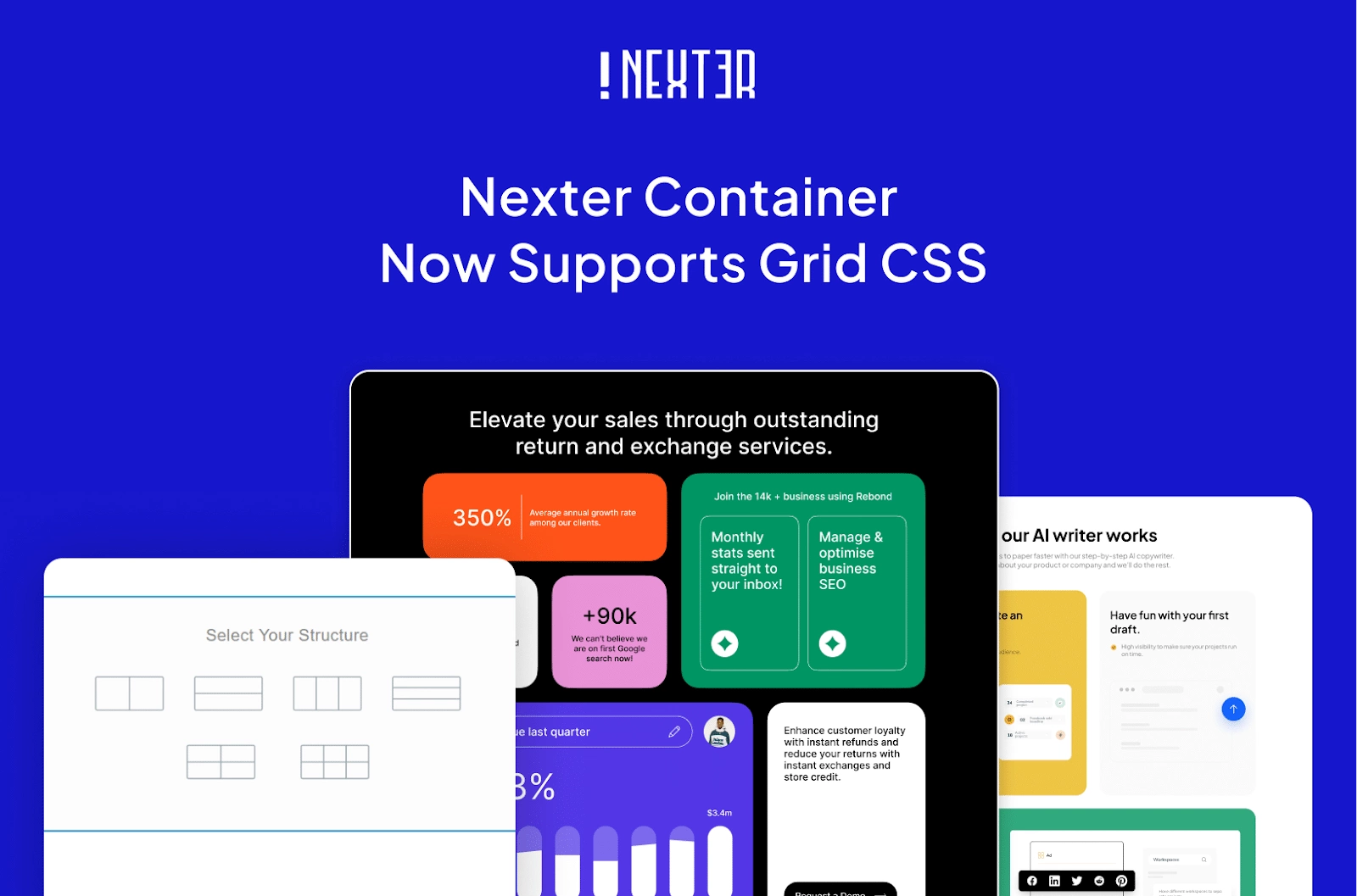
We’ve got some exciting news for Nexter users!
With the release of Nexter Block Free Version 4.1.2 and Nexter Block Pro Version 4.1.2, we’re bringing you CSS Grid Layout support for containers.
With this update, you’ll now have the power to arrange elements in rows and columns, creating impressive, unique layouts that were once difficult or even impossible to achieve.
Struggling with aligning content properly? This update has got you covered.
CSS Grid Layout gives you better control over your layouts, makes customization easier, and streamlines your design process—without the unnecessary complexity.
Let’s dive into what this update means for you, what it is, and how you can unlock its full potential!
Why You’ll Love This New Feature
Whether you’re a designer, a developer, or someone who loves customizing your website, CSS Grid makes things much more intuitive. Here’s how:
- More Control Over Layouts – You decide how elements are placed, making it easier to create unique, well-structured designs.
- Better Responsiveness – CSS Grid allows you to easily create layouts that adapt to different screen sizes. By defining both columns and rows in flexible ways, you can ensure your content adjusts smoothly across devices, providing a better experience for your users.
- Less Effort, More Creativity – No need to overthink alignment and spacing. CSS Grid does the heavy lifting so you can focus on bringing your ideas to life.
Now, let’s understand briefly what exactly CSS Grid Layout is?
What is CSS Grid Layout?
CSS Grid is a layout that allows you to design web pages in a true grid format—both rows and columns. Instead of placing elements one after another, like a list, you can arrange them precisely where you want in a structured grid.
Think of it as having an invisible table where you can place items exactly in specific cells, making page layouts more organized and flexible.
Now, in case you’re wondering how CSS Grid compares to Flexbox, let’s break down the key differences.
How is CSS Grid Different from Flexbox?
Both CSS Grid and Flexbox help in arranging content, but they work differently:
- Flexbox is like a conveyor belt—it moves things in one direction (either row or column). It’s great for menus, buttons, or lists.
- CSS Grid is like a chessboard—it allows you to place elements in both rows and columns. It’s best for full-page layouts where you need multiple sections aligned properly.
If you need a structured, multi-section layout, CSS Grid is the way to go!
Where Can You Use CSS Grid Layout? [Practical Use Cases]
CSS Grid is super useful when designing webpages and can be applied in various design scenarios.
Here are some common situations where it’s the perfect choice:
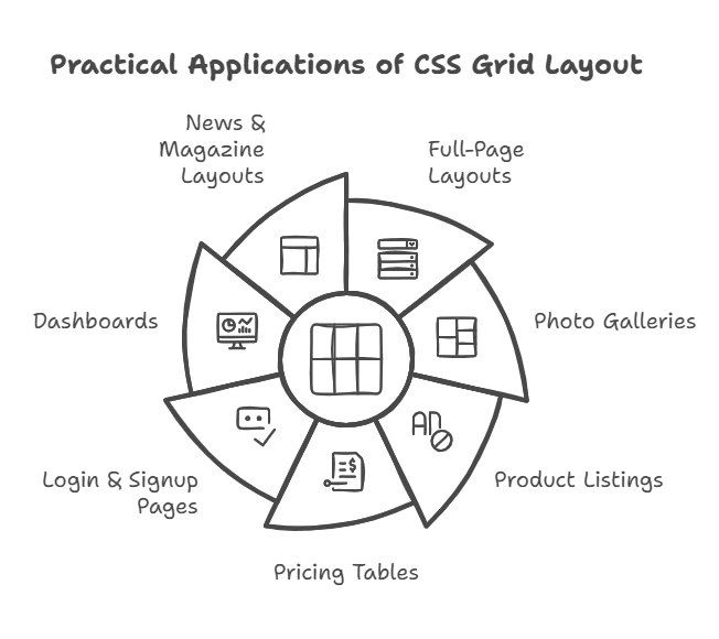
1. Full-Page Layouts
If your webpage has multiple sections (header, sidebar, content, footer), CSS Grid helps you arrange them neatly.
Example: A blog layout where the header is on top, the sidebar on the left, and the content in the center.
2. Photo Galleries
Want a Pinterest-style image gallery? CSS Grid lets you arrange images in a way that fits naturally, even if some are bigger than others.
Example: A gallery page where images fit together like a puzzle without messy spacing.
3. Product Listings
For an online store, CSS Grid helps display products evenly and aligned, no matter how much text each product has.
Example: A shopping page where all product boxes look the same size, even with different content.
4. Pricing Tables
Need to display multiple pricing plans? CSS Grid keeps all the columns aligned, making it easy for users to compare plans.
Example: A pricing page where all plans are displayed side by side, even if one has more details than the others.
5. Login & Signup Pages
For a login page, CSS Grid makes it easy to create a split-screen layout with a form on one side and an image or text on the other.
Example: A login page where the form is on the left, and a welcome message is on the right.
6. Dashboards
Dashboards usually have charts, stats, and widgets that need to be arranged properly. CSS Grid helps structure them neatly.
Example: A dashboard where the revenue chart is big, and smaller stats are arranged around it.
7. News & Magazine Layouts
For websites with lots of articles, CSS Grid helps organize everything into a clean and readable format.
Example: A news website where the main story is bigger, and other news articles are arranged below it.
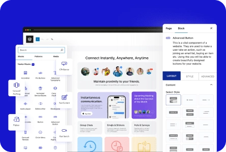
How to Use CSS Grid Layout in Nexter Blocks?
Nexter Blocks makes it super easy to create a Container CSS Grid.
You can watch this video to get an understanding of how this feature works:
Easily Manage Rows and Columns!
Nexter Blocks gives you the flexibility to easily manage rows and columns as per your requirements.
You can set the row and column width and also further customize them to get the desired look that you want for your design.

Stay updated with Helpful WordPress Tips, Insider Insights, and Exclusive Updates – Subscribe now to keep up with Everything Happening on WordPress!
And that’s how you’re all set to create unique grid designs!
Try it now!
With CSS Grid Layout support in Nexter Block, you now have a better way to structure your website.
Whether you’re creating a full-page layout, a product grid, or a photo gallery, CSS Grid gives you more control and flexibility.
So go ahead—try out CSS Grid in Nexter Blocks and make your designs cleaner, more organized, and easier to manage!