












Gutenberg 24.2.0 RC1 went up on GitHub on 7 October 2026, and the stable release has not shipped yet as I write this. I read the whole changelog instead of waiting, because the Block Library section is the longest part of it. My count of that section is 85 entries, and most of them give an existing core block a design control it did not have before.
The headline for anyone who builds with blocks: Button gets background image, size and gradient support, ten more blocks get shadow support, and minimum width and height controls spread across dozens of blocks. The Interactivity API also gains a new directive. This post walks through what is in the release candidate, what I counted, and what it changes for people who pay for a block plugin.
One warning up front. This is a release candidate. I have not installed it, so everything below comes from the official changelog and the pages I link to, not from hands-on testing. I will say so again where it matters, and I will re-check the stable notes before treating any line here as final.
What Gutenberg 24.2 RC1 Actually Contains
The release page on GitHub is marked Pre-release, and it shows one commit to the release/24.2 branch since the tag was cut. That is a small gap, and it is the reason I am comfortable writing about RC1 at all: late commits to a branch like this are usually fixes, not new features. It is still a guess, not a promise.
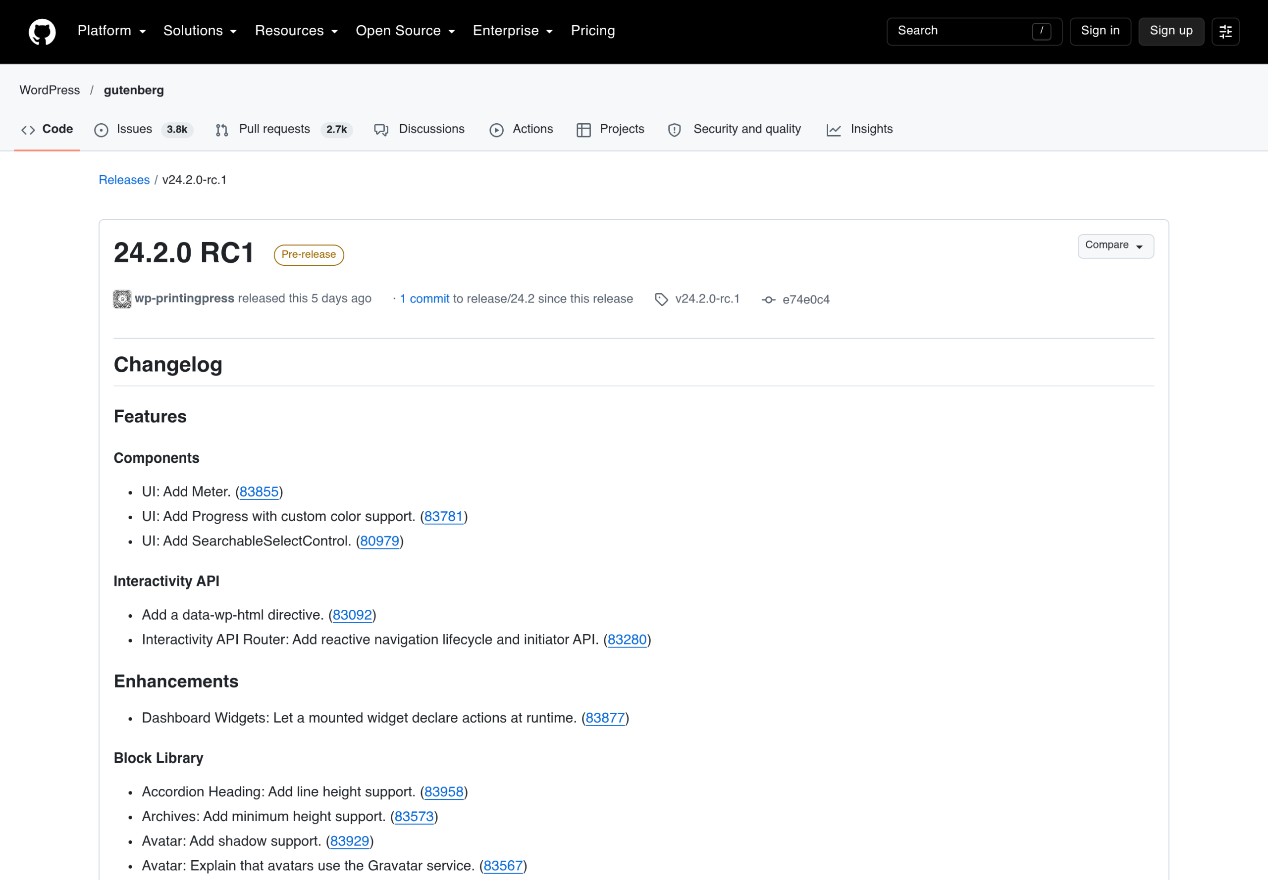
The changelog is split into Features, Enhancements and a long list of fixes. Under Features there are only five lines. Three are new UI components (Meter, Progress with custom color support, and SearchableSelectControl) and two belong to the Interactivity API. Everything else I care about sits under Enhancements, in the Block Library group.
Release timing helps set expectations. Gutenberg 24.1 had its RC on 23 September and its stable release on 30 September, which is seven days. If 24.2 follows the same pattern, stable lands around 14 October. I would not plan around that date, but it tells you the gap between this post and the final notes should be short.
I Counted The Block Library Changes
I copied the Block Library section of the RC1 changelog into a script and grouped the entries by the control they add. The section has 85 entries. These are the groups that matter for design work:
- Minimum width and height: 31 entries say “Add minimum width and height support”, plus six that add minimum width only and two that add minimum height only.
- Shadow: 10 entries add shadow support.
- Background image, size and gradient: 4 entries.
- Duotone: 3 entries (Gallery, Media & Text and Video).
- Border: 3 entries add border support (Comments Pagination, Latest Comments and Pagination), and two more add a border style option (Post Featured Image and Read More).
- Text indent: Heading and Post Author Biography, with Verse getting text columns and indent.
A count of entries is not a count of blocks, because a few blocks appear in several lines. Media & Text, for example, shows up for background, duotone, minimum size and shadow. I mention the counting method so you can repeat it yourself on the stable notes and compare.
This is the same direction I measured in 24.1. In my Gutenberg 24.1 post I counted how many blocks declared background and shadow support once the plugin was active. 24.2 does not reset that trend. It keeps filling in the gaps block by block.
Button Gets Background Image, Size And Gradient
The line that caught my eye is “Button: Add background image, size, and gradient support.” Three other blocks get the same line: List, List Item and Media & Text. Button is the one with the most real-world impact, because buttons are the part of a page people style most.
Until now, a button with a patterned or photographic background meant custom CSS or a plugin. The changelog entry means the core Button block will expose those controls in the inspector. I have not opened them, so I cannot tell you where the controls sit, what the size options are named, or whether they behave the same on the front end as in the editor. Treat the entry as a signal, not a how-to.
There is a second Button change that is easy to miss: “Button: Only open the link popover on explicit user action.” If you have ever clicked a button in the editor to select it and had the link box pop open in the way, you know why that matters.
Shadows Spread To Ten More Blocks
Ten entries add shadow support in this release: Avatar, Buttons, File, Gallery, List, List Item, Media & Text, Paragraph, Social Icons and Tab List. Two of those are worth a note.
- Buttons gets shadow support at the container level. Together with the Button background change, the core button row becomes a lot more flexible.
- Paragraph getting a shadow is the odd one. It reads like a text-shadow or box-shadow decision more than a common design need, and I would wait for the stable notes before building anything on it.
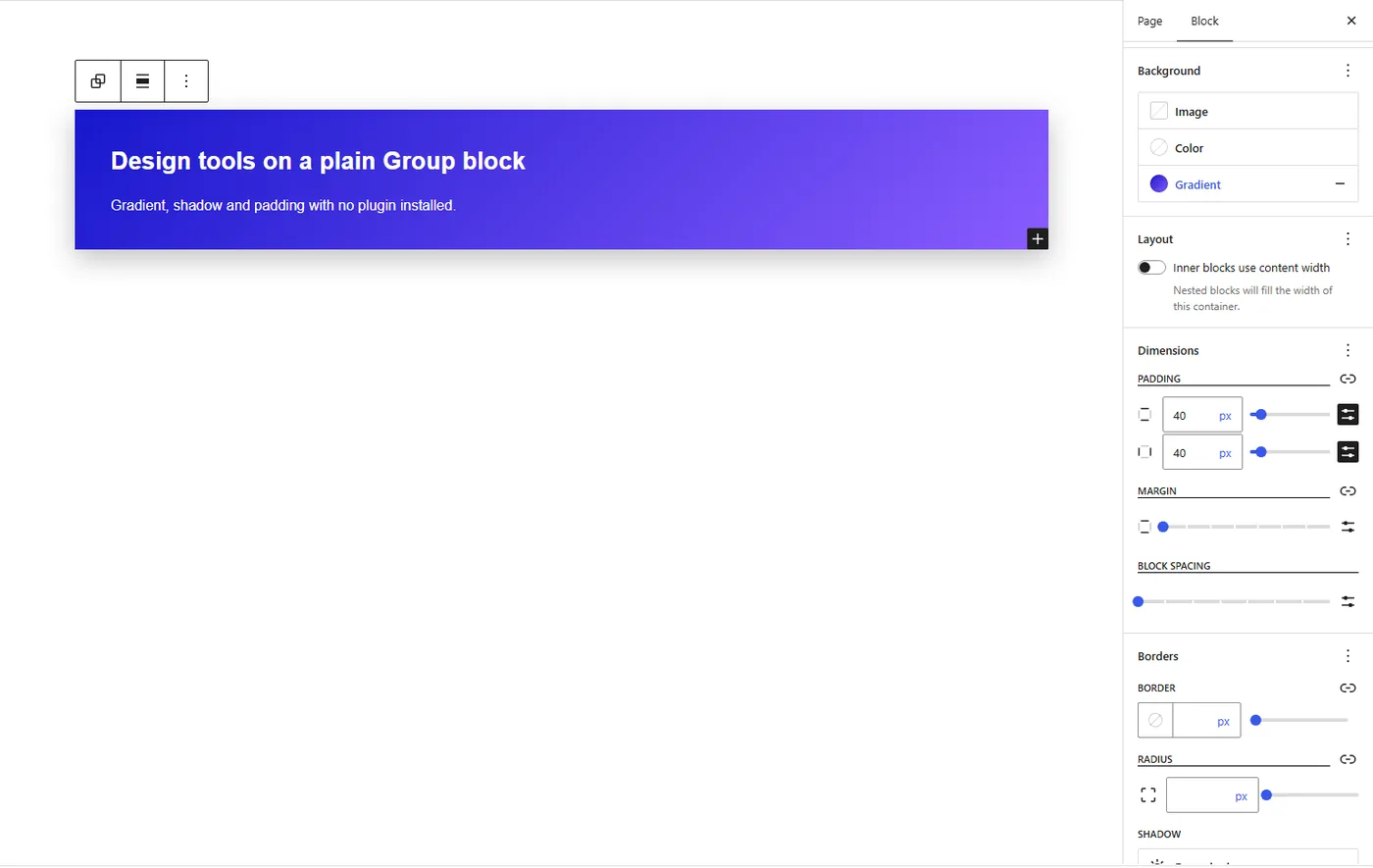
Here is what a shadow control looks like on a block that already had it. This is the core Styles tab on a Group block in Gutenberg 24.1, the same screenshot I used in my last post. The 24.2 entries put the same kind of panel on more blocks.
Minimum Width And Height Reach Dozens Of Blocks
This is the least glamorous change and probably the most useful one. 31 entries add minimum width and height support. The list includes Columns, Code, Embed, File, Footnotes, Gallery, Heading, Latest Posts, Media & Text, Post Title, Post Excerpt, Read More, Site Title and Site Tagline, among others.
Minimum sizes matter because they let a block keep its shape when the content inside it is short. If you have ever padded an empty-looking card with a spacer block, this is the control that replaces that habit. Again, I am describing the changelog line, not a tested behaviour.
Smaller Changes Worth Knowing About
- Columns: the column count slider is removed. If your muscle memory reaches for it, expect a different workflow in the stable release.
- Gallery: Order By controls for a static gallery, and the controls are consolidated into the settings sidebar. Gallery also gets duotone, minimum size and shadow.
- Icon: block bindings support for the icon attribute, which is a quiet step for dynamic icons.
- Quote: button colour support.
- Poetry: fit text support.
- Navigation: the link UI now lists allowed blocks and searches every entity type.
- Post Comments Form: font family support.
Interactivity API And Component Changes
Two Interactivity API lines are in the Features list. The first adds a data-wp-html directive. The second adds a reactive navigation lifecycle and an initiator API to the Interactivity API Router. If you build interactive blocks, those two are the ones to read in full on the release page.
The component work is mostly for developers: Meter, Progress, SearchableSelectControl, and a long list of styling migrations. One line says Badge is deprecated. If you maintain a plugin that imports components from the Gutenberg packages, scan the Components group in the stable changelog before you update.
Plugin Versus Core: When Do You Get This?
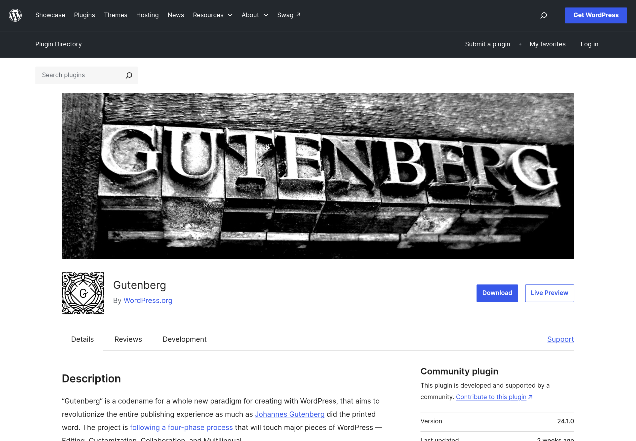
The WordPress.org plugin page above still shows 24.1.0, which confirms that 24.2 is not stable yet. Gutenberg features reach WordPress core only when a core release bundles a newer Gutenberg. The sidebar of the Make WordPress Core blog says the current release in progress is WordPress 7.2, but I could not find a statement of which Gutenberg version 7.2 will bundle, so I will not promise any 24.2 control for 7.2.
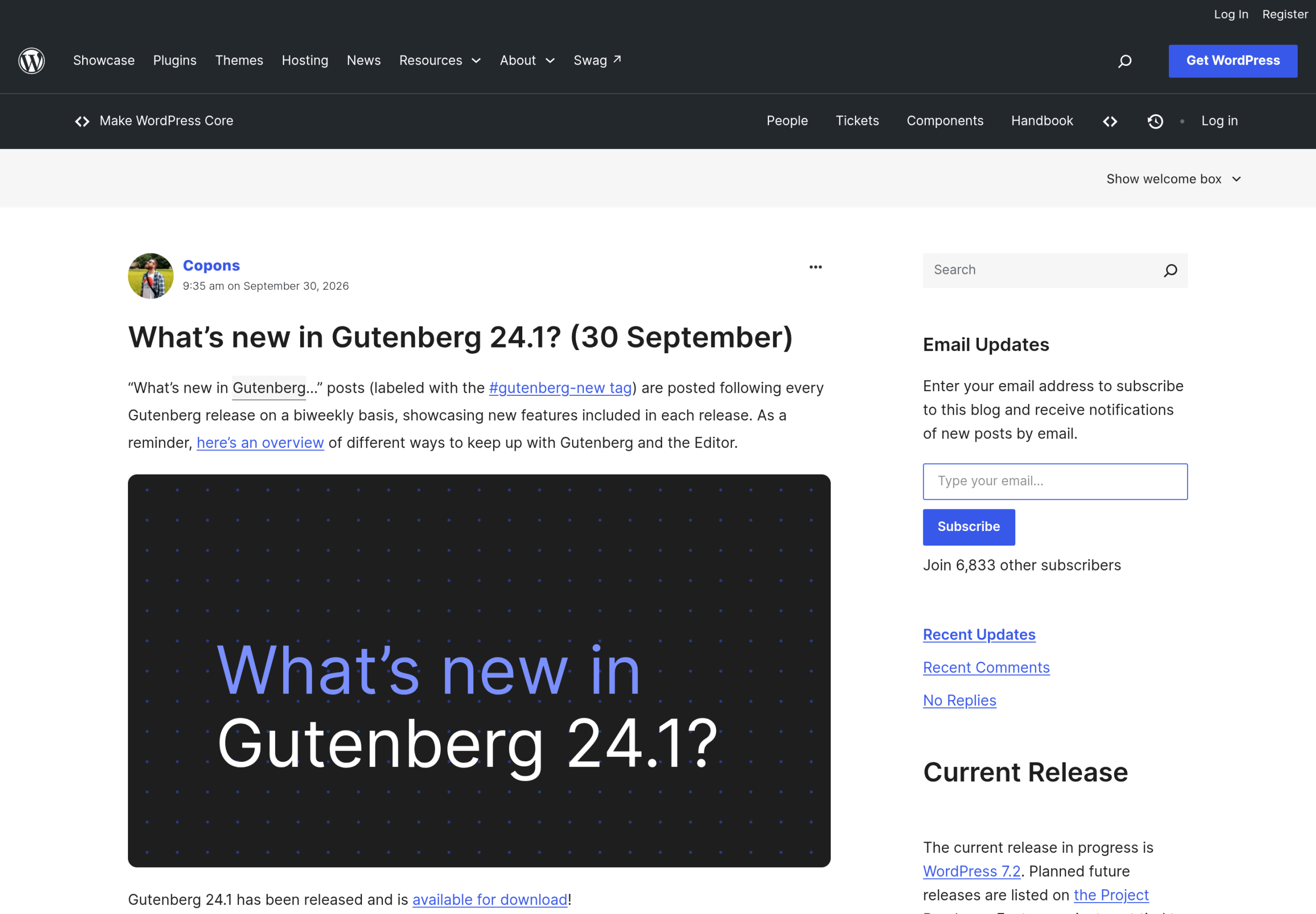
That is the safe reading for production sites. The plugin gives you these controls now, with a release every two weeks, and I would keep it to staging. Core gets them later. If you are deciding whether to drop a block plugin this month, the real answer depends on the WordPress version your site runs, not on the Gutenberg number.
For the 7.2 schedule and what is already planned, see my WordPress 7.2 roadmap post.
What Core Still Does Not Give You
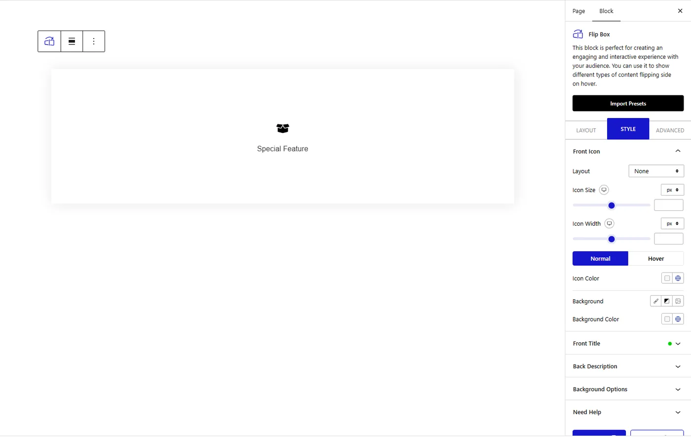
Design controls are only half of what a block library sells. The other half is blocks core has no equivalent for. Nexter Blocks is our plugin, so weigh this section accordingly, but the examples are checkable. The Flip Box below is a two-sided block that turns over on hover. 24.2 adds shadows and backgrounds to containers, and it does not add a flip interaction.
Nexter Blocks lists 90+ blocks on its product page, including the form builder, popup builder and table of contents blocks that I mentioned in the 24.1 post. Which of them are free and which are Pro is on the free versus Pro page, and I would trust that page over my memory.
If you already use Nexter Blocks, the 24.2 Button change is not a reason to stop. It is a reason to compare. I wrote a companion post on Button styling in Nexter Blocks that sets the new core controls next to what the Advanced Button block already does.
How I Would Read The Stable Changelog When It Lands
Gutenberg changelogs are long, and the order on the page is not the order of importance. This is the routine I used on RC1, and I will repeat it on the stable release:
- Read Features first. It is short, and it is where new APIs and components appear.
- Jump to Block Library and group the entries by the control they add. A pattern shows up quickly: the same control repeated across many blocks usually means a shared block support was extended, not 31 separate pieces of work.
- Search the page for the words Deprecate and Remove. This release has both: Badge is deprecated and the Columns count slider is removed.
- Check the last section for Bug Fixes that touch blocks you use. A feature you want is no use if the block it lives in has an open regression.
- Compare the stable page with this RC1 list. Any entry that disappears is a feature that was pulled, and I would want to know before telling anyone it exists.
Who Should Care About This Release
It depends on how you work, so here is the split I would give a friend:
- Site owners on a block theme: you will feel this when WordPress core bundles it. Until then nothing changes, and there is no reason to install a release candidate on a live site.
- Agencies and freelancers: test the RC on a staging copy of a real client site. Button, Buttons, Media & Text and Gallery are the blocks most likely to change how a layout looks, and a quiet default change is easier to catch before a client sees it.
- Plugin and theme developers: read the Components group and the Interactivity API entries in full. Deprecated components and a new router lifecycle are the two items most likely to need a code change on your side.
- People who pay for a block plugin: make a list of the three blocks you use most and check whether each is now covered by a core block with the new controls. That list is more useful than any feature count, mine included.
Questions I Expect About This Release
Is Gutenberg 24.2 Stable Yet?
No. As I write this, the latest tag on GitHub is v24.2.0-rc.1, published on 7 October 2026. The WordPress.org plugin page still lists 24.1.0 as the current version.
Can I Install The Release Candidate On A Live Site?
I would not. A release candidate is meant for testing, and Gutenberg already ships every two weeks. A staging copy gives you the same look at the new controls without the risk.
Will These Controls Be In WordPress 7.2?
I do not know, and I have not found a statement that says which Gutenberg version 7.2 will bundle. WordPress core picks up Gutenberg features when a core release bundles a newer version, so the answer will come from the 7.2 release notes.
Does Core Button Now Replace A Button Plugin?
For backgrounds and gradients, it moves closer. For the rest of what button plugins offer, such as hover effects and icon placement, the RC1 changelog does not list an equivalent. I compare the two in the Button post linked above.
Should You Change Anything Today?
My answer is no, with one exception. Nothing in an RC should change a live site. If you run a staging site and like to test early, install the release candidate there and open Button, Buttons and Media & Text first, because those are the blocks with the biggest design changes.
If you pay for a block plugin mainly for shadows, backgrounds and minimum sizes, 24.2 narrows that gap further. It does not remove the case for blocks core still lacks, and it does not help until the controls reach core. I would revisit the decision once WordPress 7.2 names its bundled Gutenberg version.
What This Doesn’t Cover
- I did not install Gutenberg 24.2.0 RC1. Every claim comes from the GitHub changelog and the pages linked here.
- I did not test how any of the new controls render on the front end or how they behave with block themes.
- I did not verify which of these controls will be in the stable release. One commit has landed since RC1, and I do not know what it changed.
- I do not know which Gutenberg version WordPress 7.2 will bundle, and I have not guessed.
- I did not compare Nexter Blocks with other block plugins feature by feature. That needs each vendor changelog on the day you read this.
Suggested Reading
- Gutenberg 24.1: Design Tools Now Reach Almost Every Core Block
- WordPress 7.1 Adds Tabs, but Not a Table of Contents. Do You Still Need a Blocks Plugin?
- How to Use Responsive Block Styles in WordPress 7.1
- WordPress 7.2: Release Date, Ipsum Theme, and Every Feature on the Roadmap
- What Is Gutenberg?
To try the blocks mentioned above, start with Nexter Blocks, or read the Nexter Theme page if you want a block theme to go with them.
